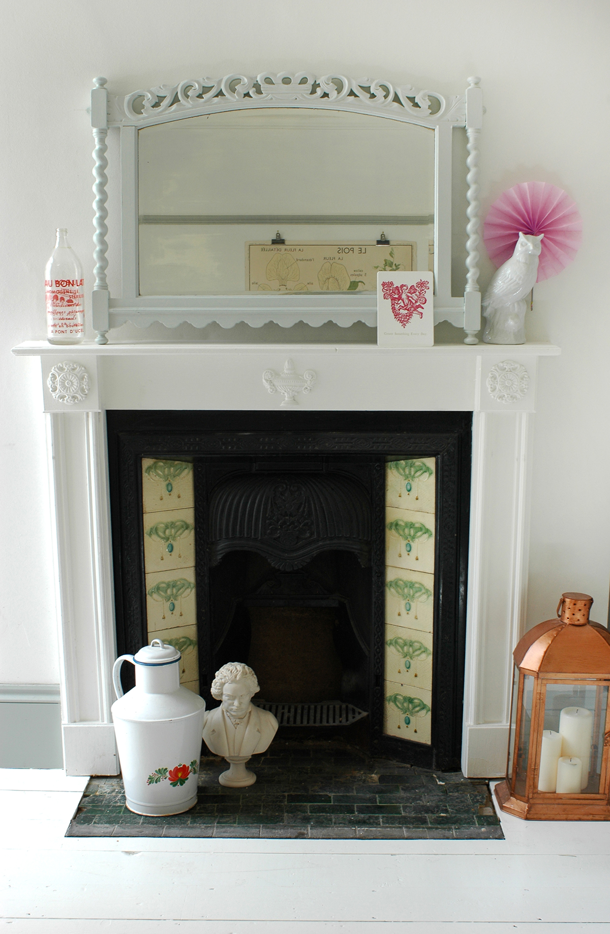
A few months go I had the most intriguing of emails. It came from a woman who had lived in my house nearly 20 years ago. She had come across pictures of our kitchen/dining room online, and spotted the fireplace which she had purchased in an antiques shop in Glasgow in the 1980's - apparently it was bright orange when she found it! She cleaned it up and brought back to Kingston to install in the house. Shona emailed me to let me know of this crazy coincidence and we began chatting about the house and what it was like when she lived here. It really is incredible the connections that can be made via the world wide web right?!
It feels particularly poignant to be looking back on the history of our home, as we prepare to move on from it ourselves after nearly seven years of living here. (that's if we EVER exchange, it's been the longest process). Shona sent me a few pictures of the interior when she was living here which was SO interesting, so I thought it would be fun to show the comparisons (which also includes some shots from when we bought it in 2009) and I did a little interview with Shona, to find out about her time living here...

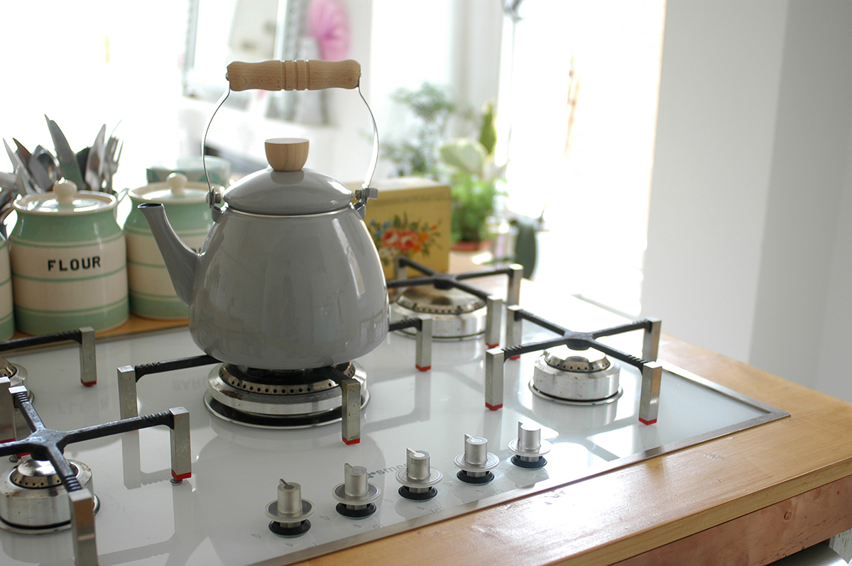
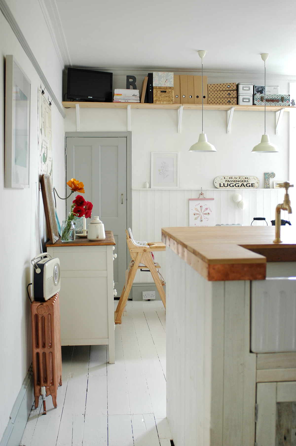
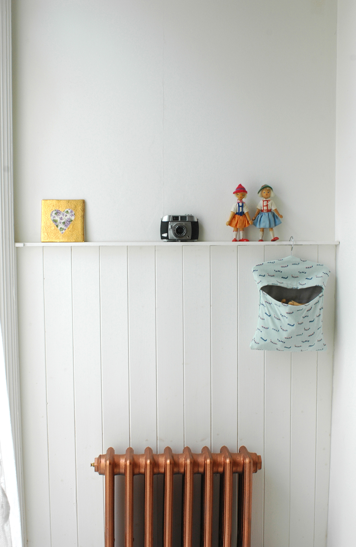
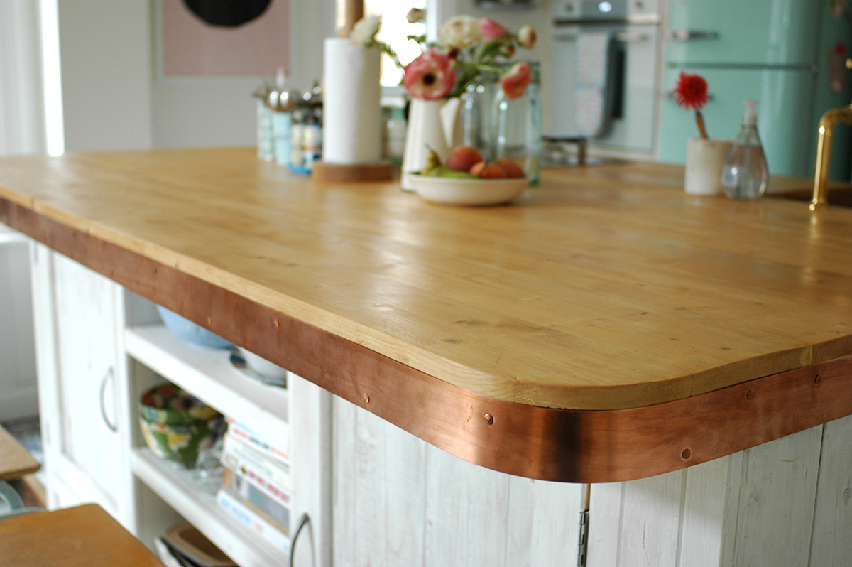
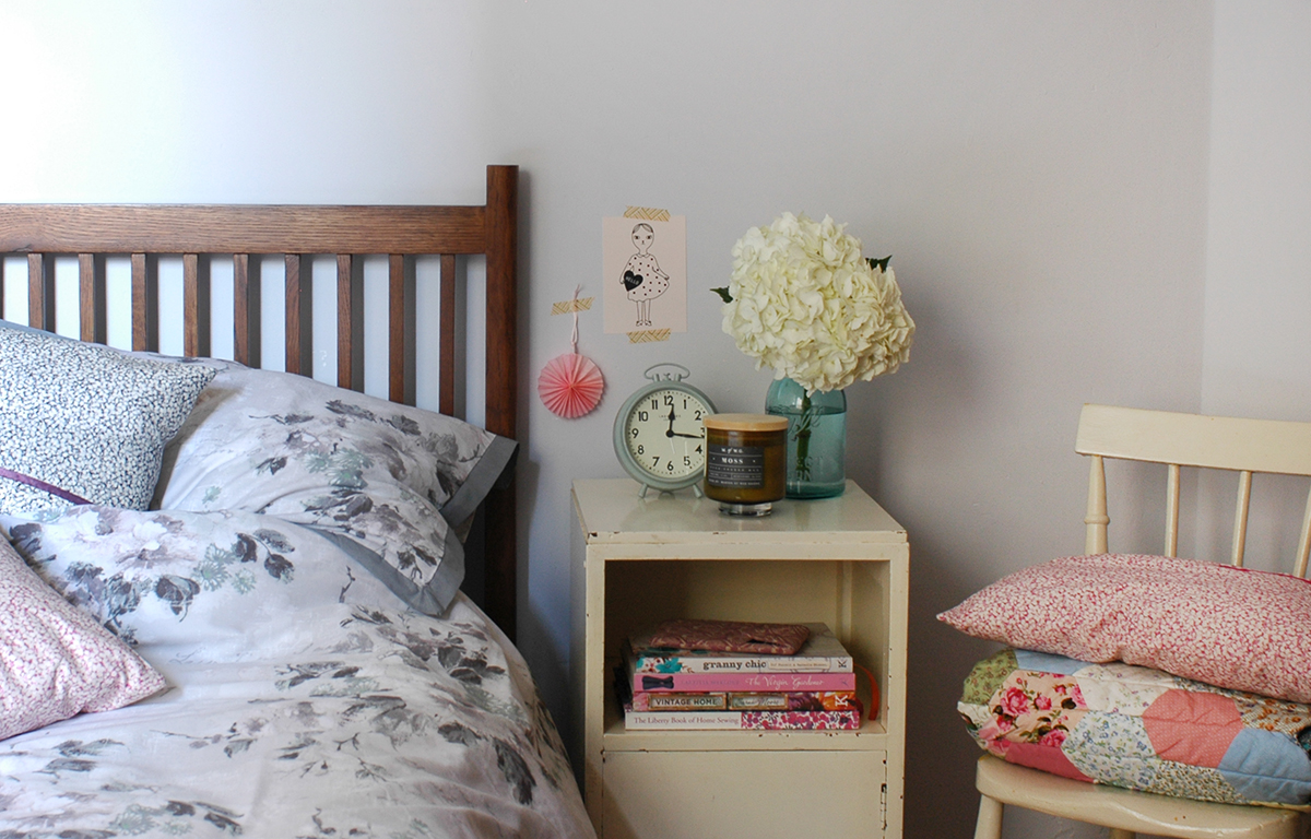
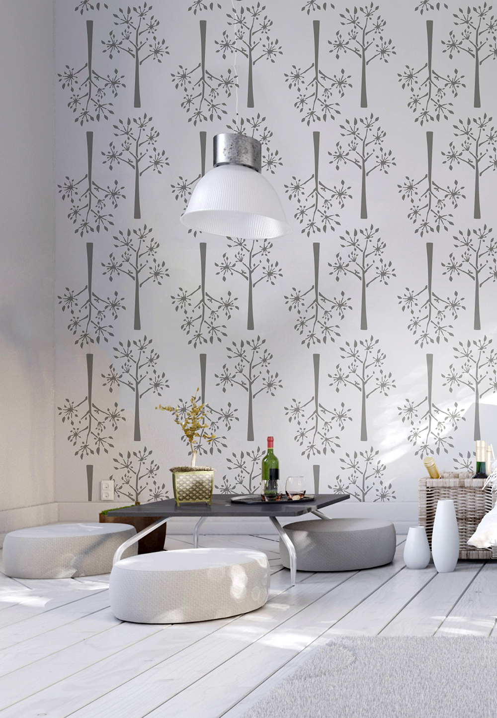
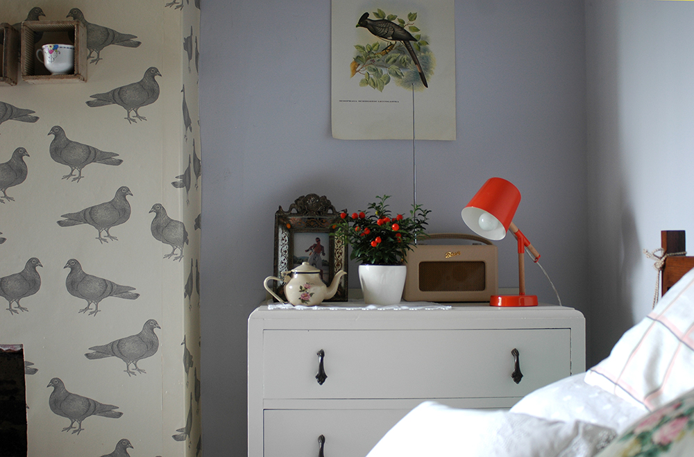
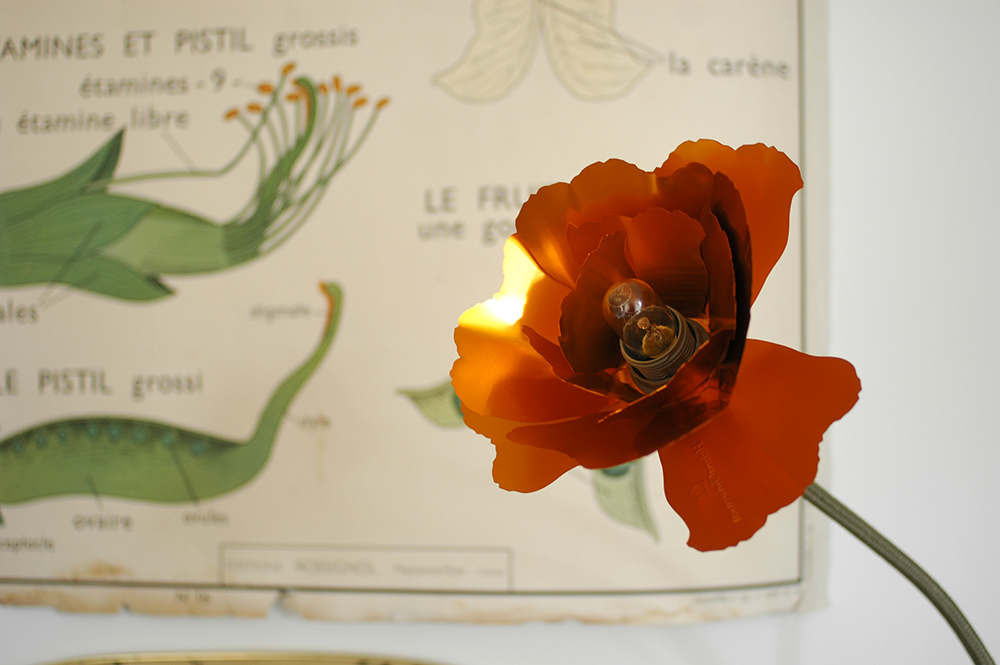
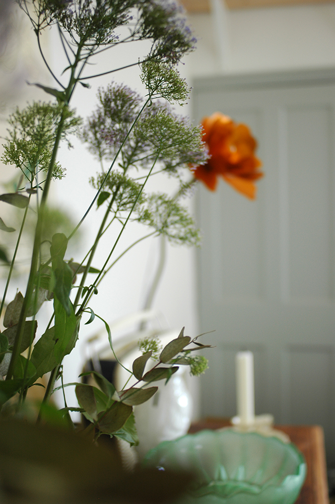
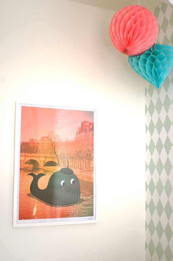
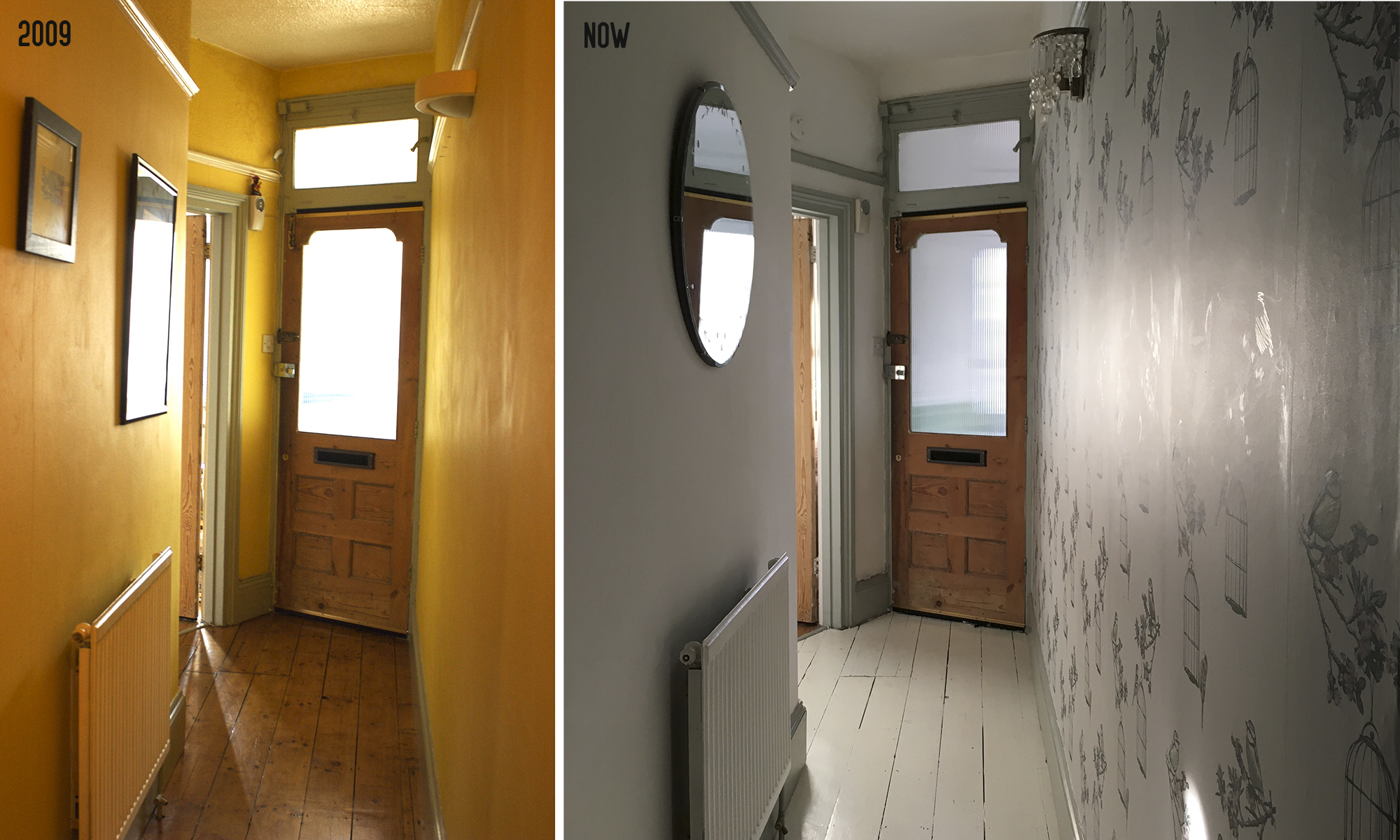
Now image by Cathy Pyle
Patchwork Harmony: When did you live in the flat?
Shona: 1989-1997
Patchwork Harmony: What was the house like when you bought it?
Shona: Not great, it needed totally refurbished - it was in a real mess. It needed a new bathroom, kitchen and it didn't have any central heating so that had to go in too. Before buying the flat we looked at one of the top floor flats next door, which was immaculate but I think about 25k more (!) - that gives you an idea of how much work needed to be done on it. I think the purchase price was around 72k.
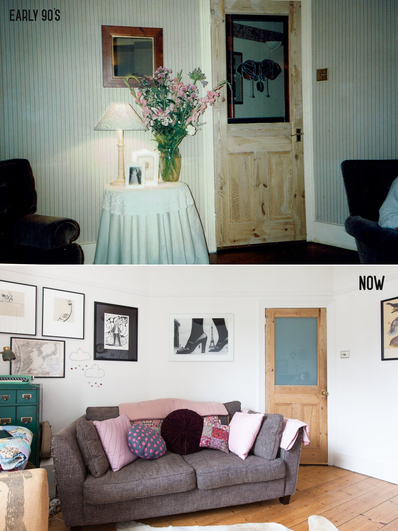
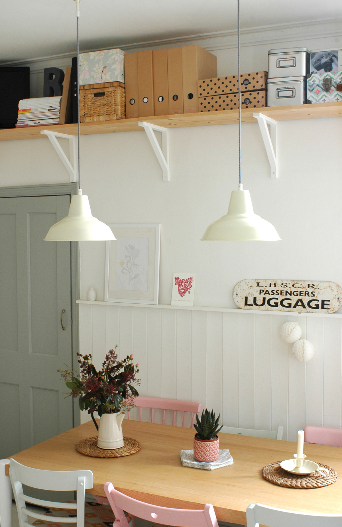
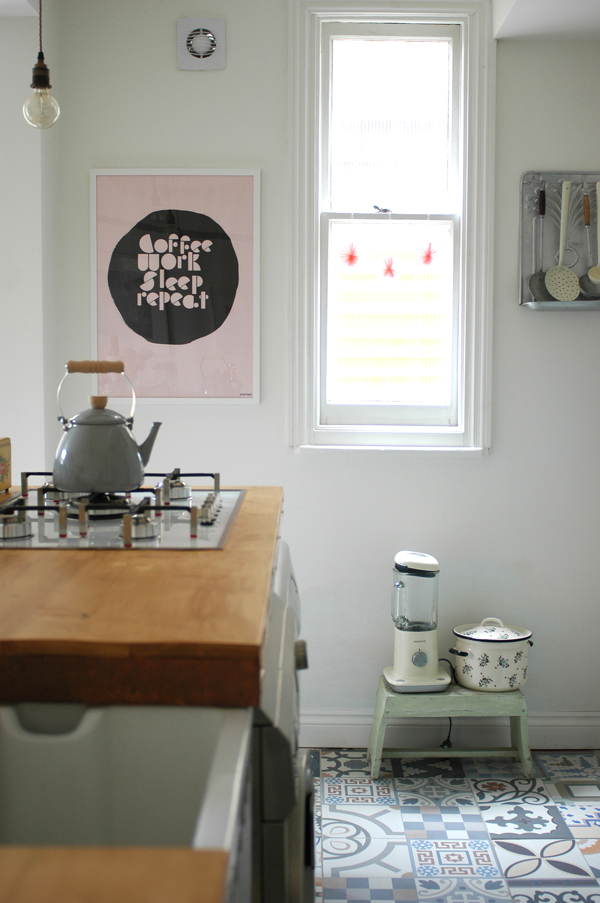
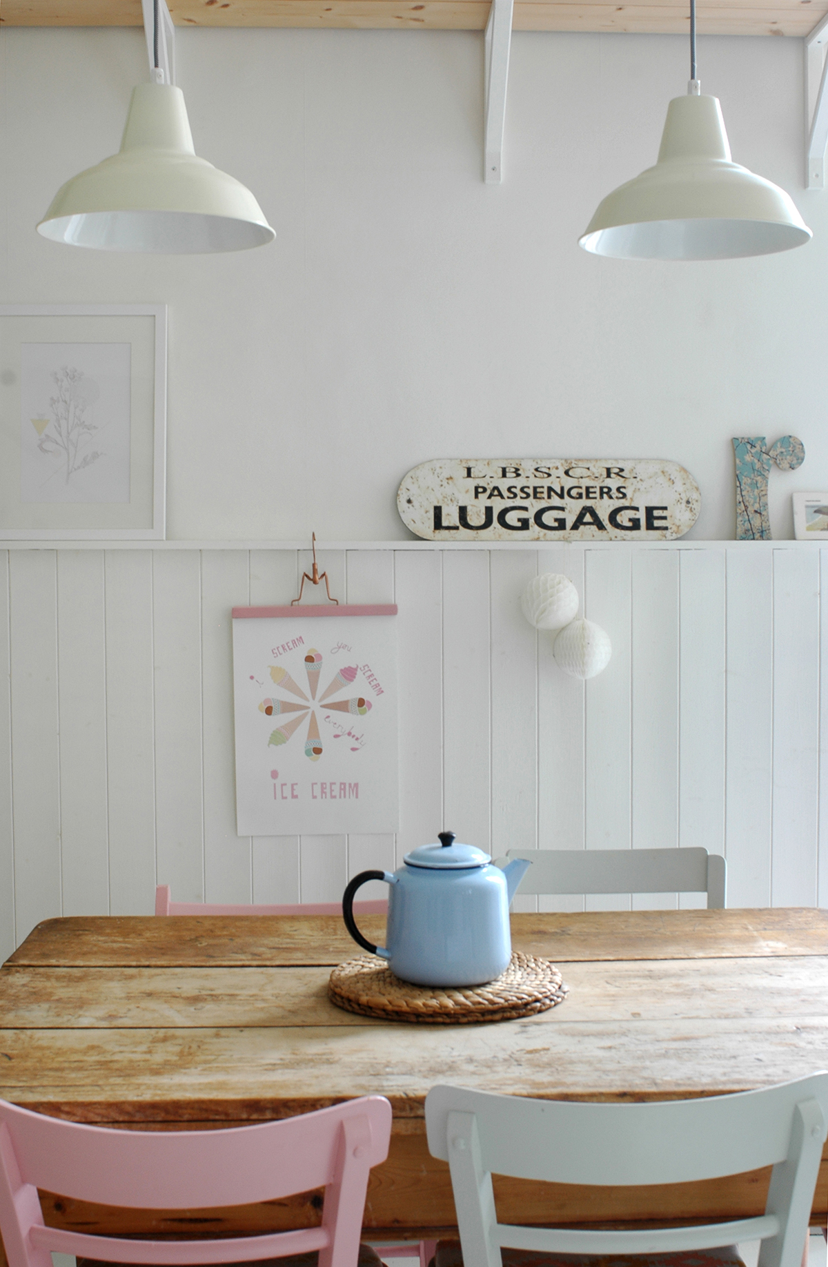
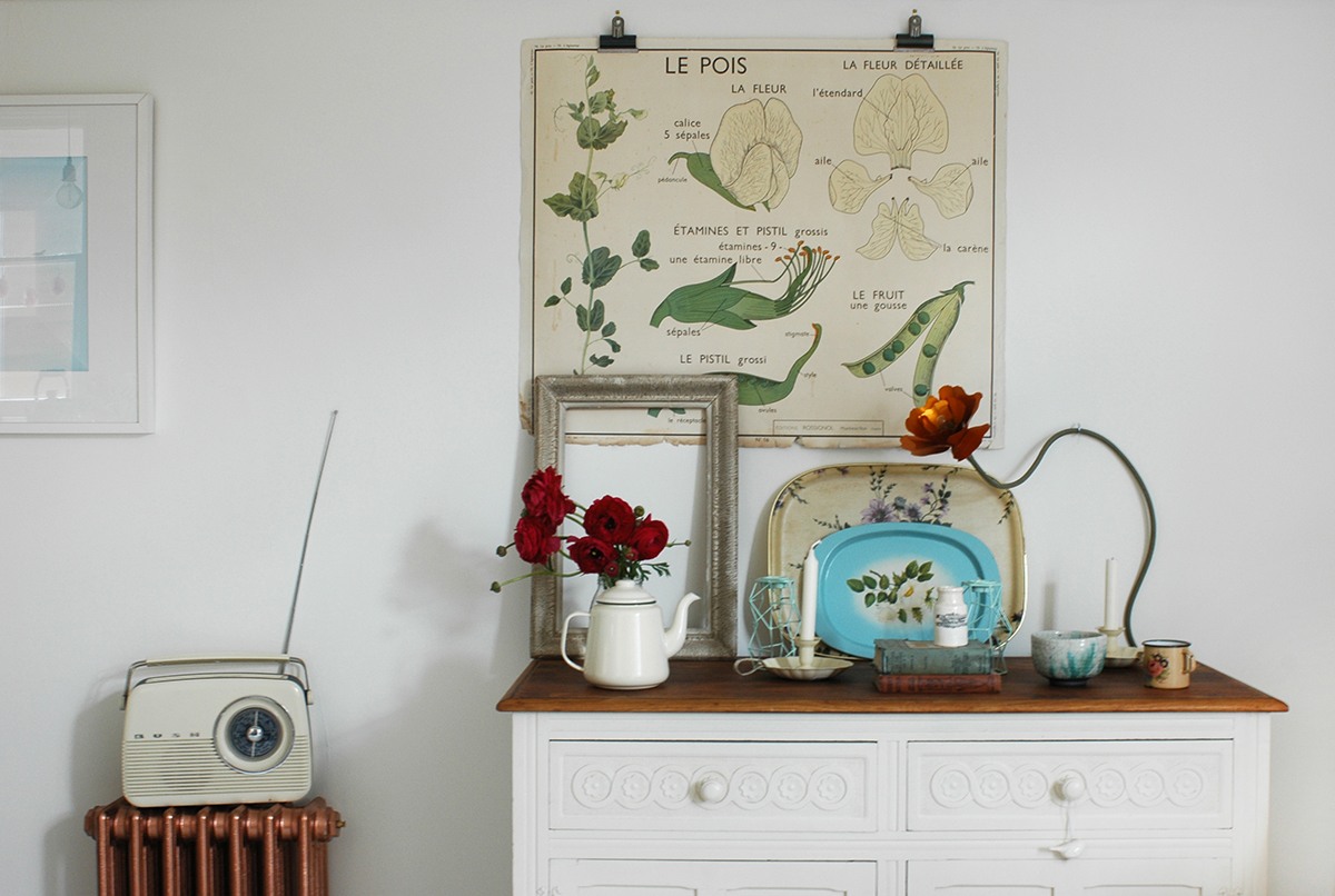
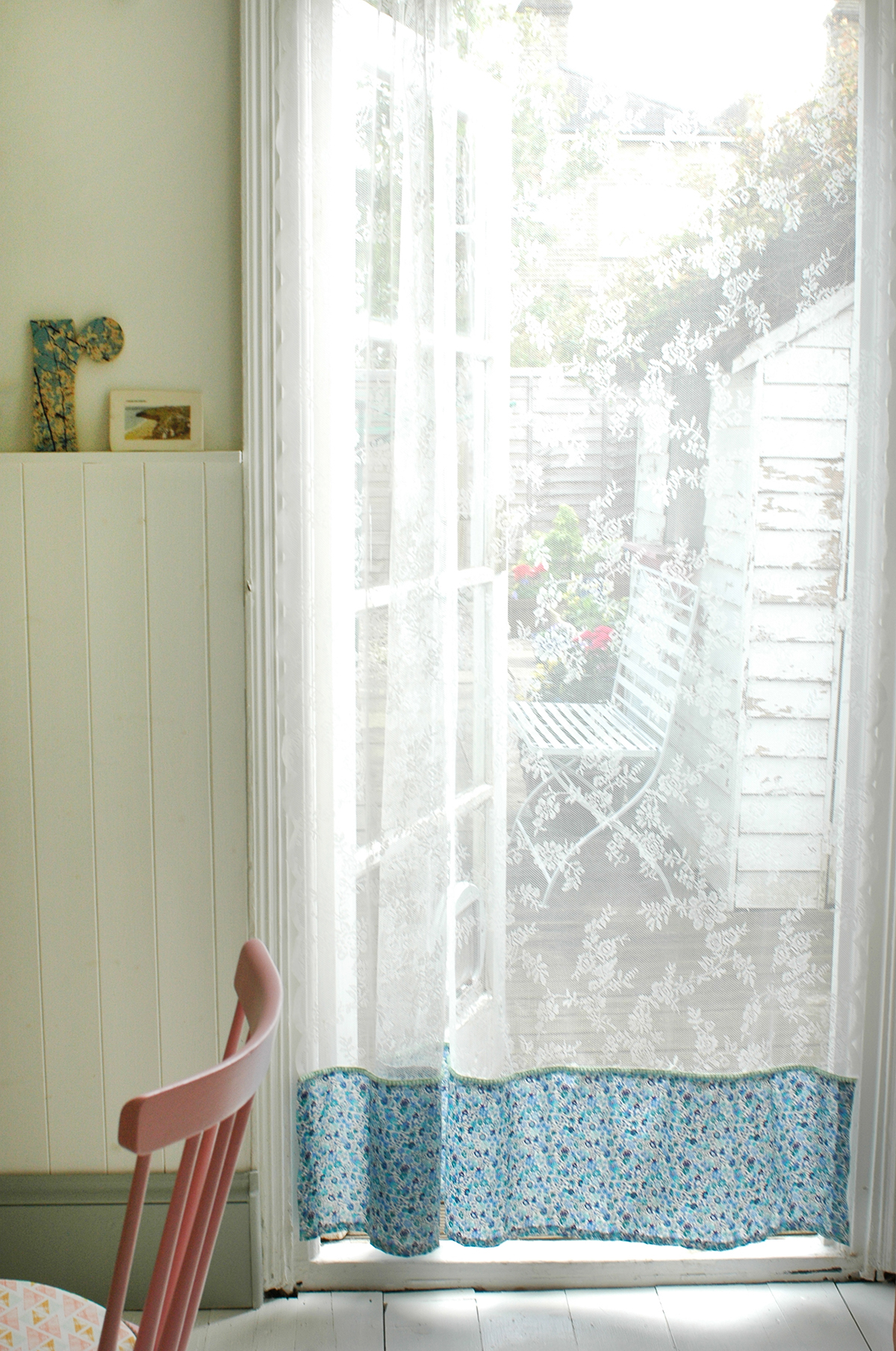
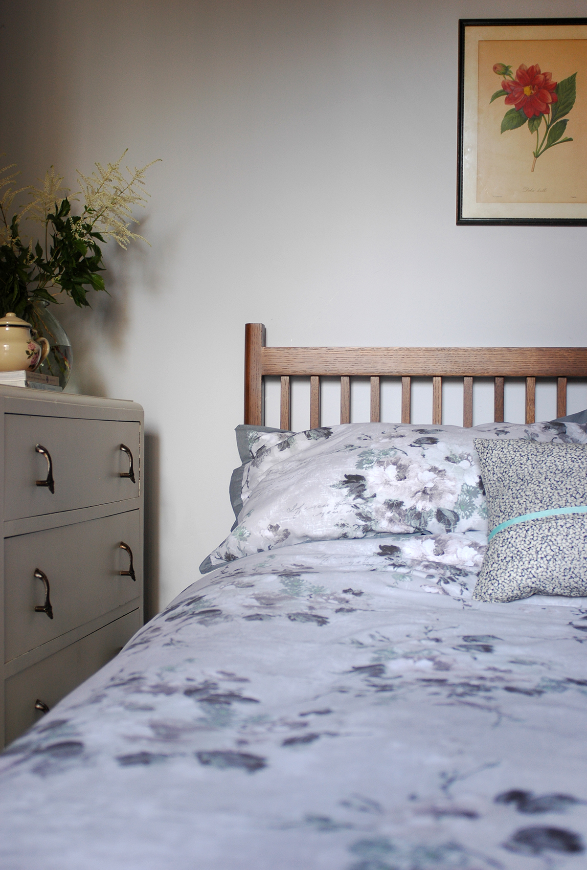
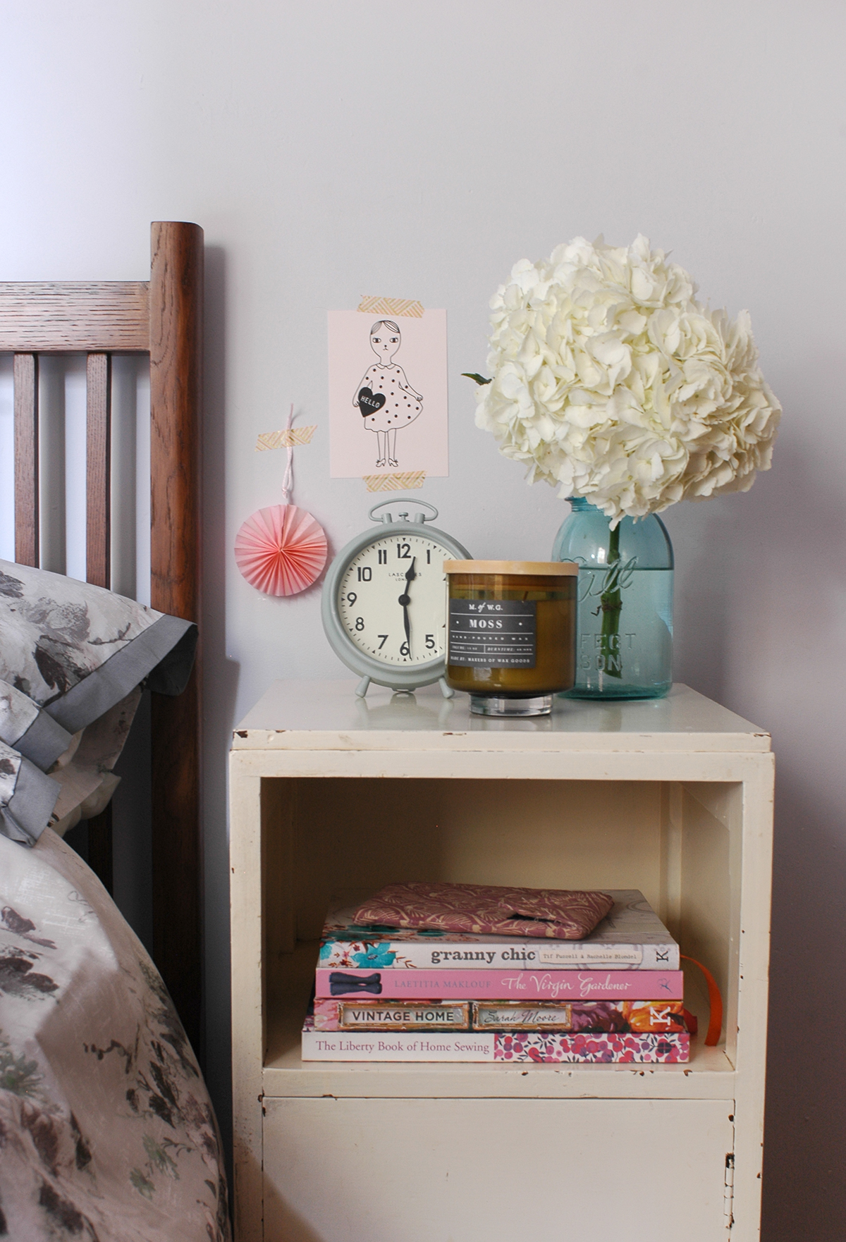
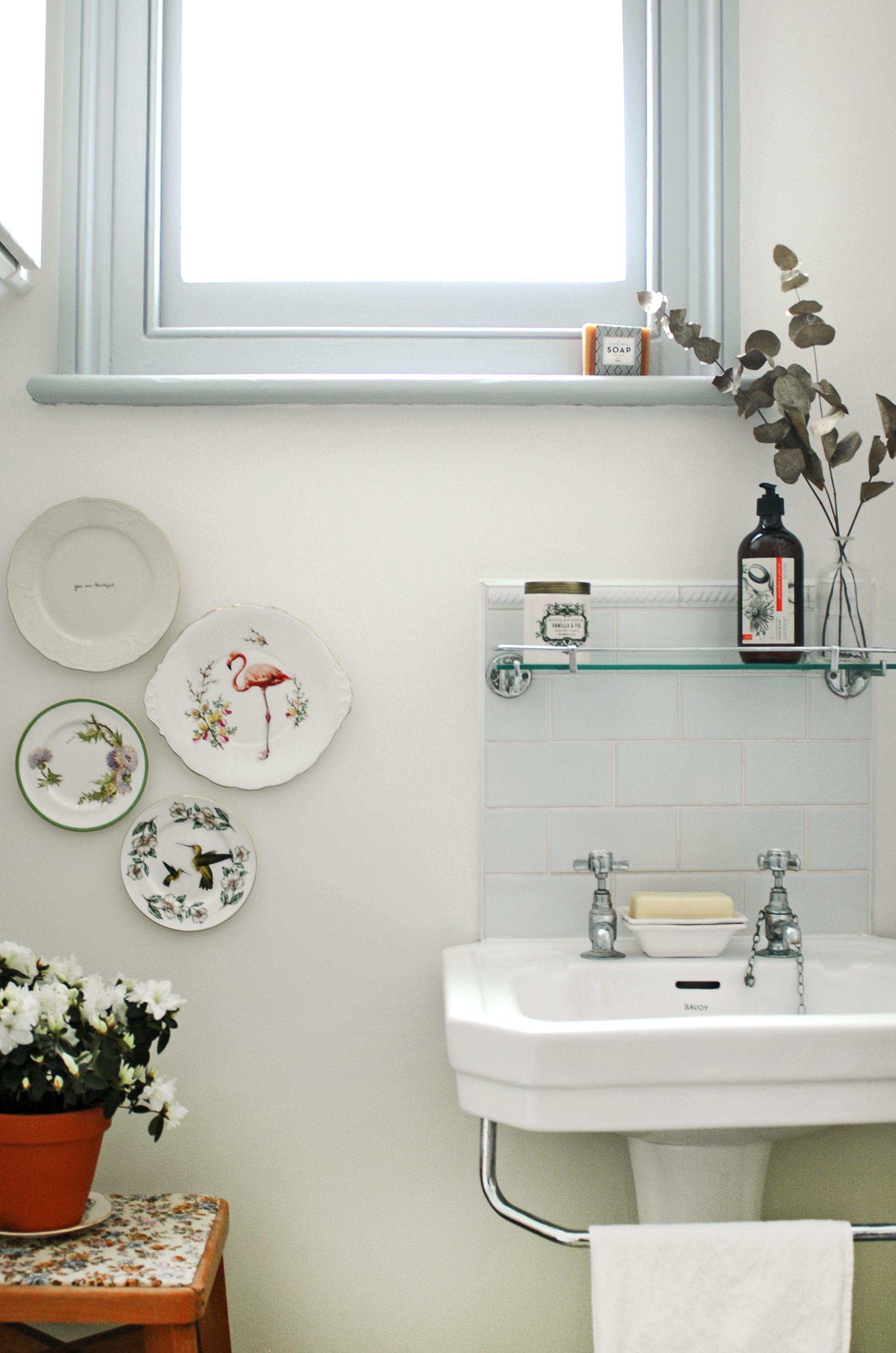
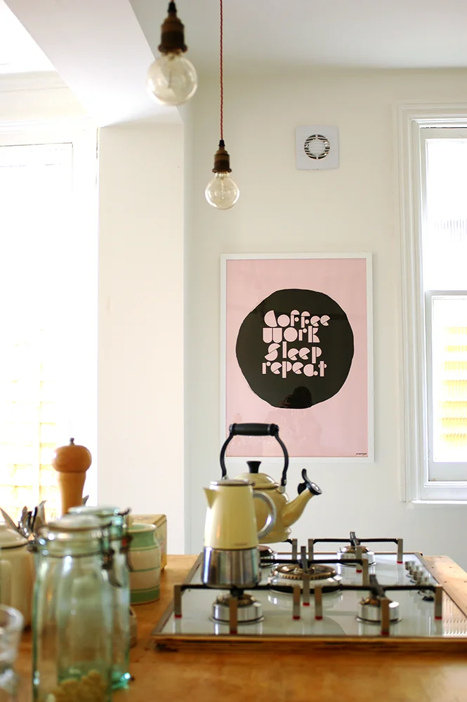
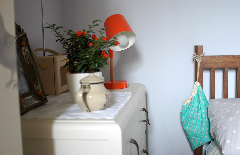
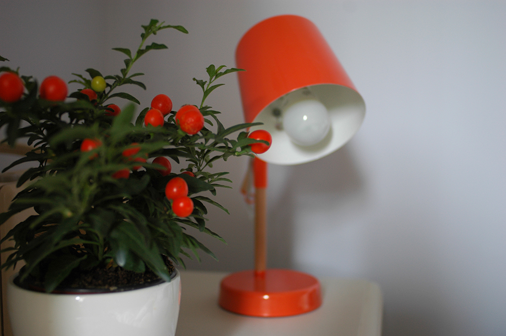
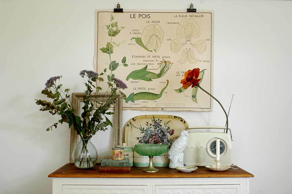
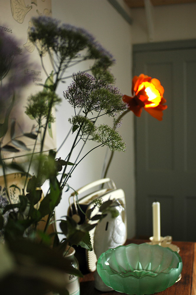
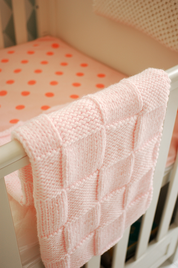
Now image by Cathy Pyle
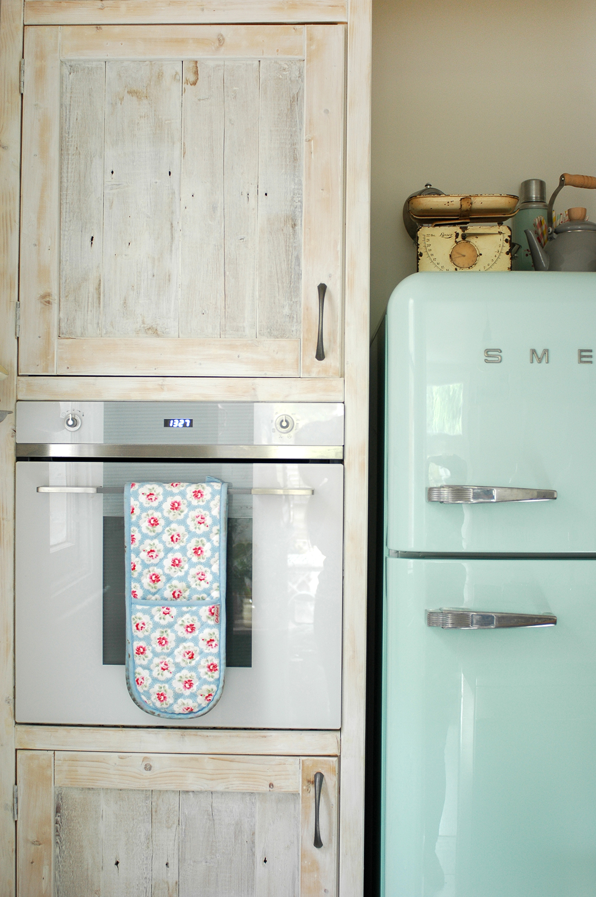
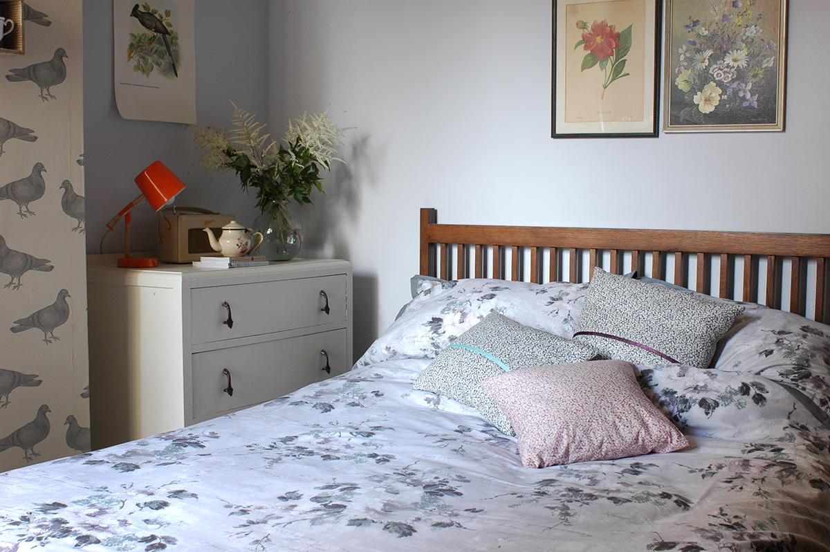
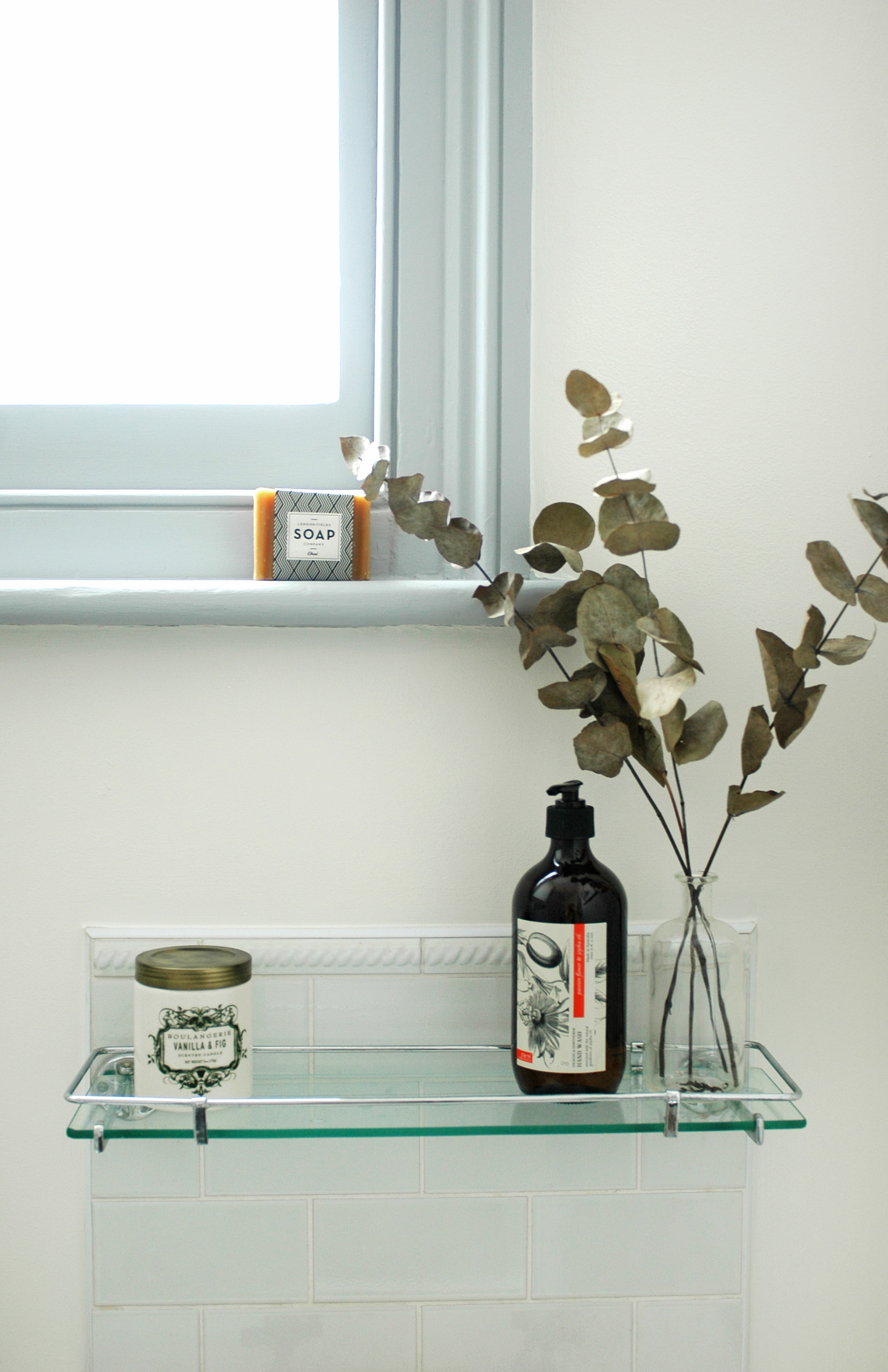
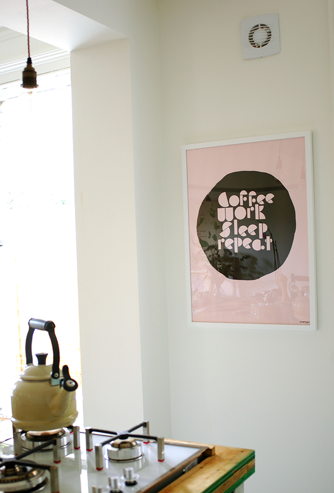
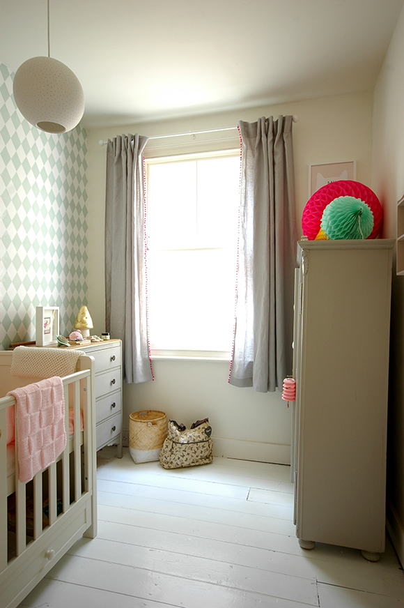
Now image by Martina O'Shea
Patchwork Harmony: Do you know any history of the house prior to you living there?
Shona: I think it had been rented, although for some reason I think I was told squatters had been living there before we moved in!
Patchwork Harmony: What are your memories of living here?
Shona: I had an interesting time there. It was exciting in the early years as I had moved down from Scotland and just started my career. It was my first step on the property ladder. I got married when I was living there and then divorced just after I left the house so it's a place of real mixed memories and emotions. I also got two cats when I was there: Pyramus and Thisbe and my fondest memories seem to be of them as kittens!! I asked my friend if she had any interesting memories of the house and she said she remembered dancing a lot!

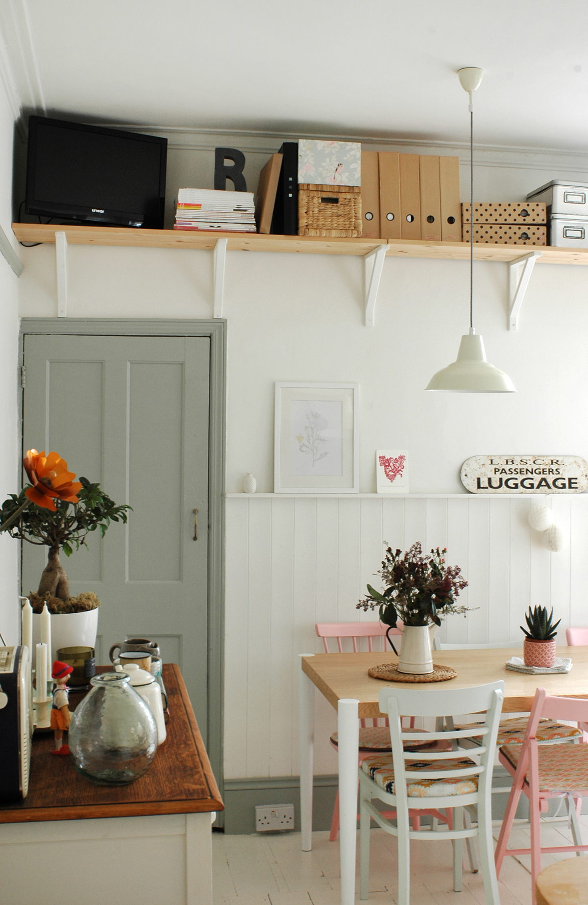
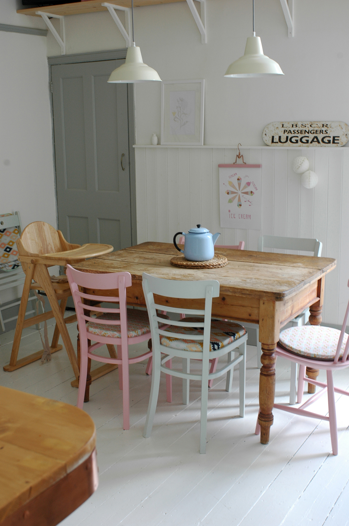
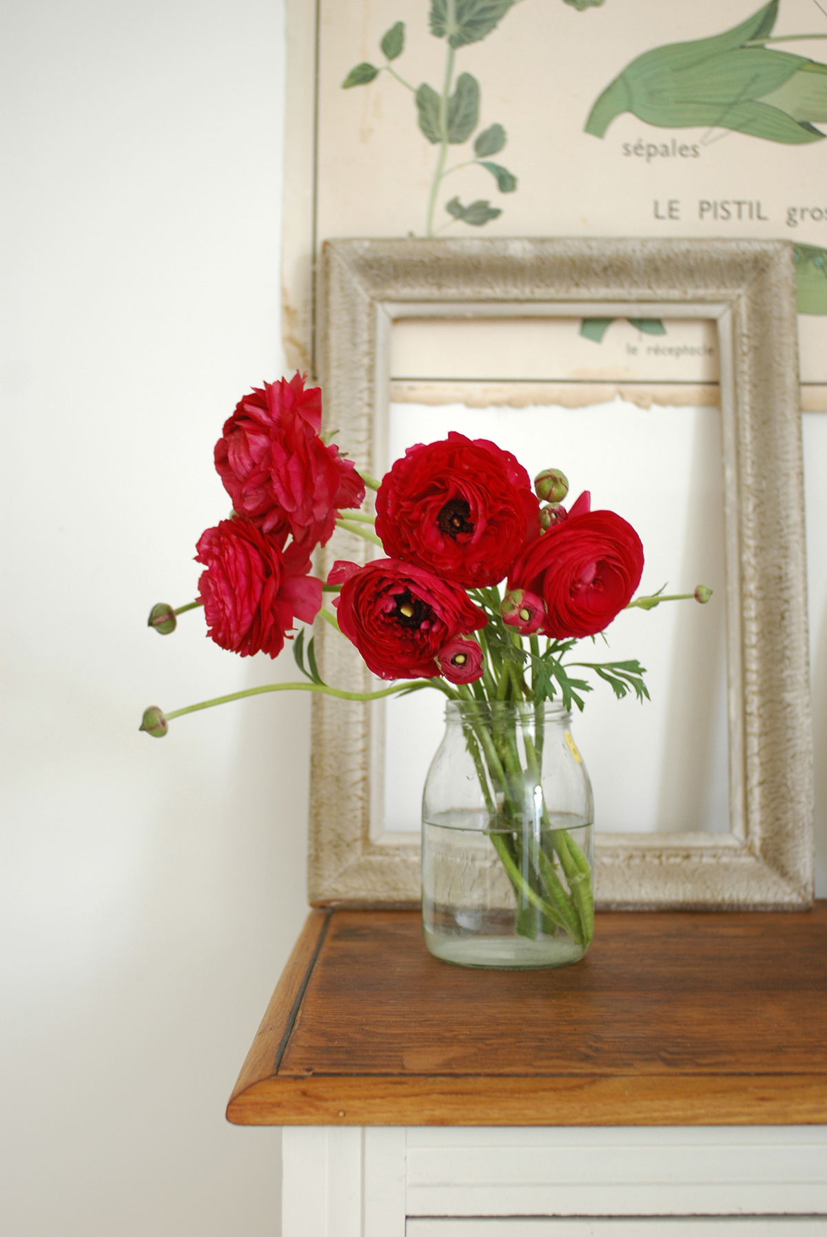
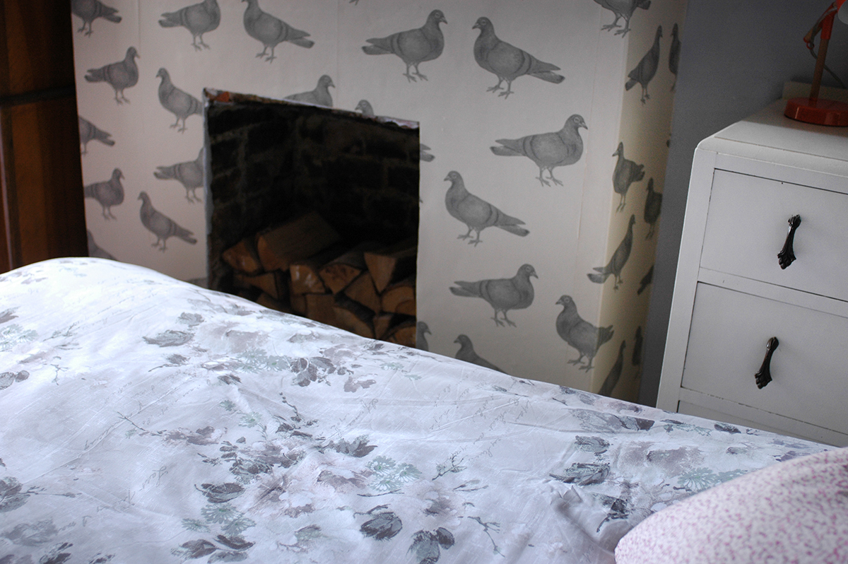
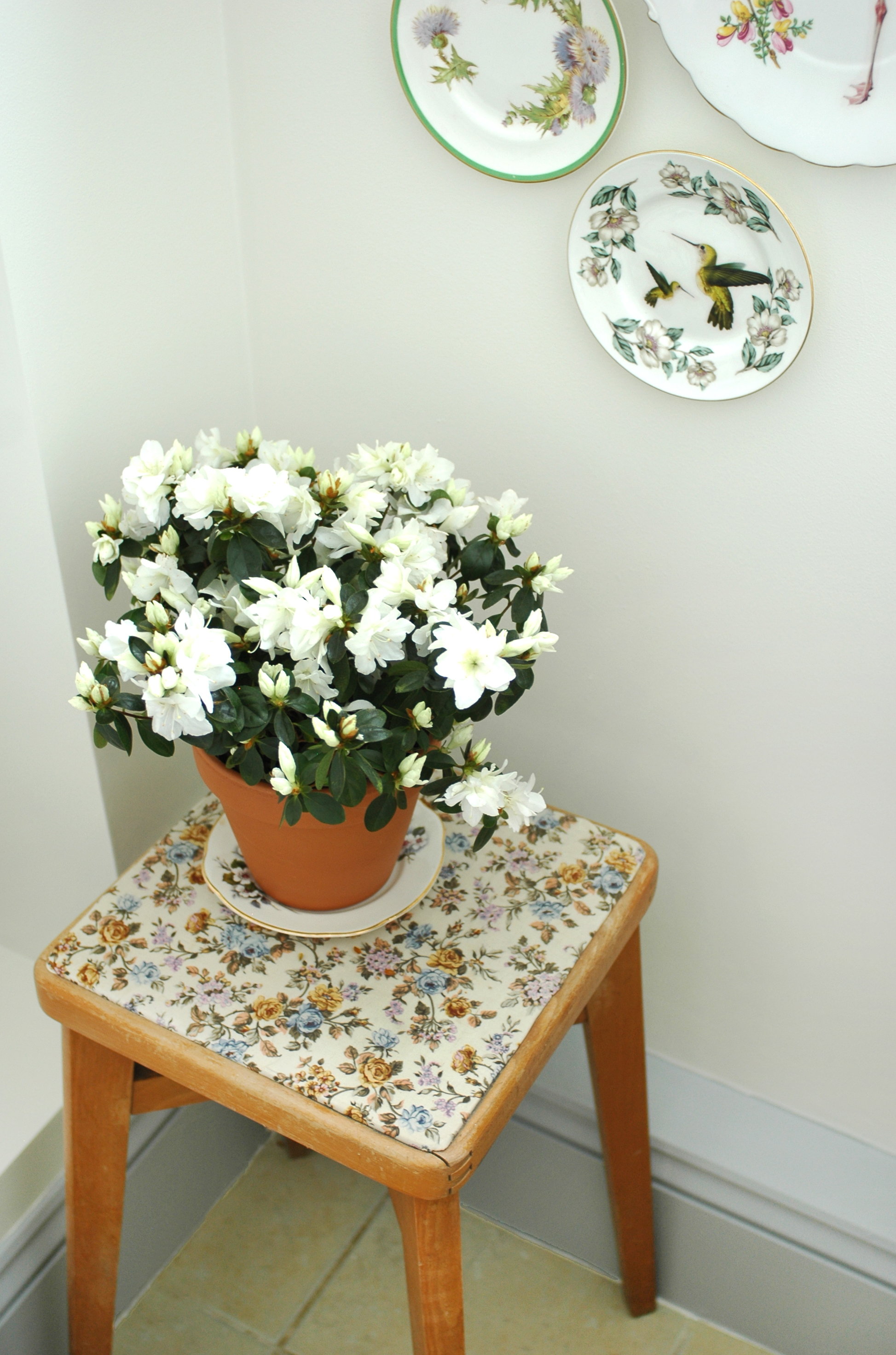
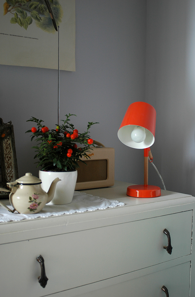
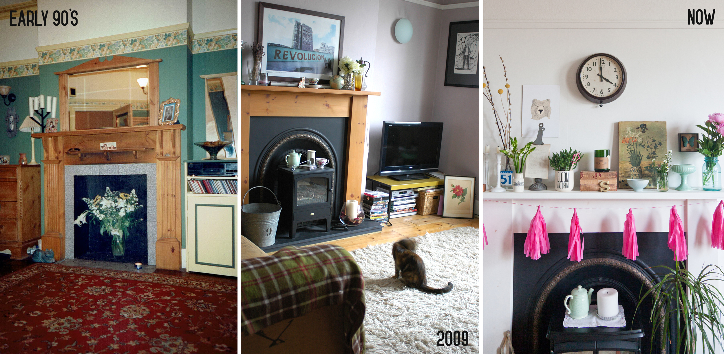
Now image by Cathy Pyle
Patchwork Harmony: Did you make many changes to the house in terms of layout etc?
Shona: The kitchen was made slightly bigger. The only other thing was the garden was really small and as we got on well with our neighbour we decided to make it one large shared garden instead of two smaller ones.
Patchwork Harmony: Things are very different now from when you lived here in terms of where homeowners find inspiration for decor - how did you go about it back then? Where did you find ideas? Where did you shop for home furnishings etc?
Shona: If I remember correctly I loved Habitat, Laura Ashley and Designers Guild. I must have got inspiration from magazines and my brother is a designer so he was a great help. I remember I had to learn how to make soft furnishings as it was too expensive to buy them all - curtains, cushions etc. Festoon blinds were all the rage in the 80s :)

Patchwork Harmony: How long did you live here for and why did you decide to move on?
Shona: From 1989-1997 then we moved about fifty metres up the road until 2006!
Thank you Shona for getting in touch and giving this little insight into the history of our home! I don't know if this is interesting to anyone else, but I felt the need to document on here even if it just for myself.
I guess when you are about to move on from a home that has been so important in your life, it is a nice time to reflect on and look back on your time there. It was our first home we purchased together, we became a married couple while living here, and we brought our first child into the world here, not to mention that the magazine I founded is named after this place! It's funny how there are some similarities in the life events Shona experienced while living here too. Her email definitely wins the prize for the most intriguing of the year!