My home on made.com/unboxed

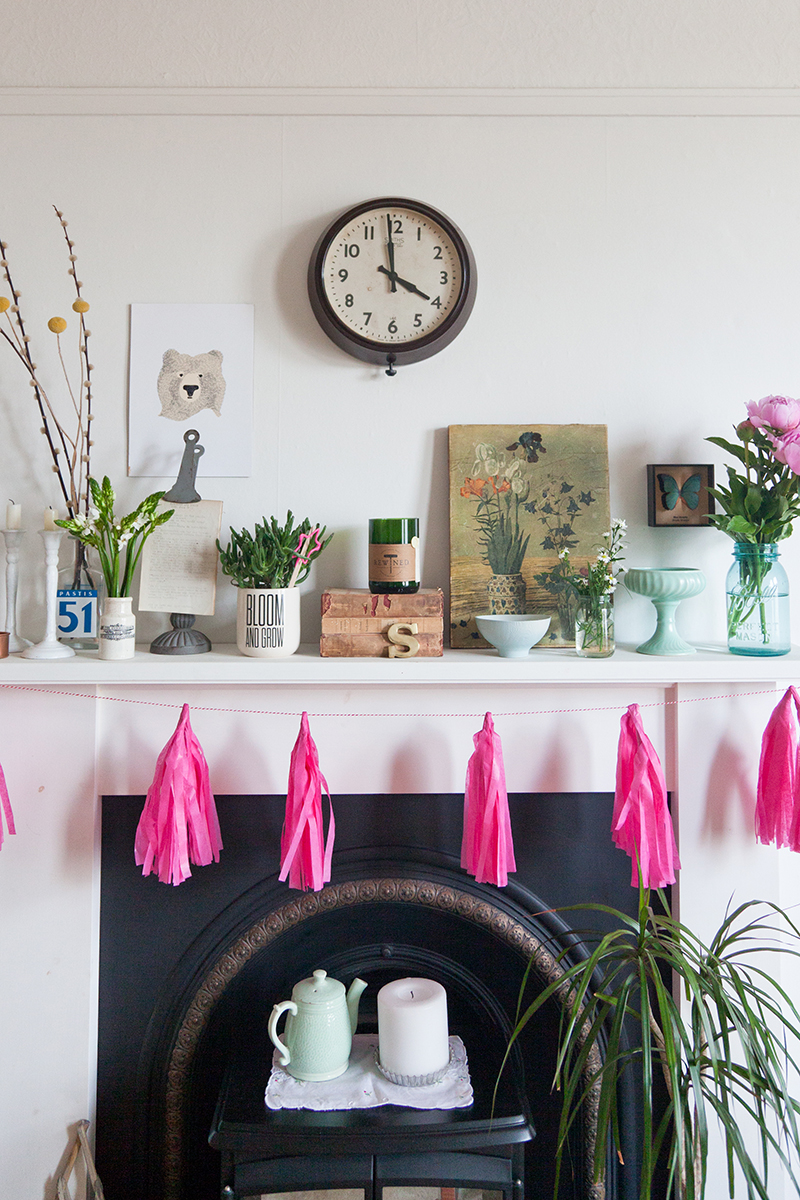
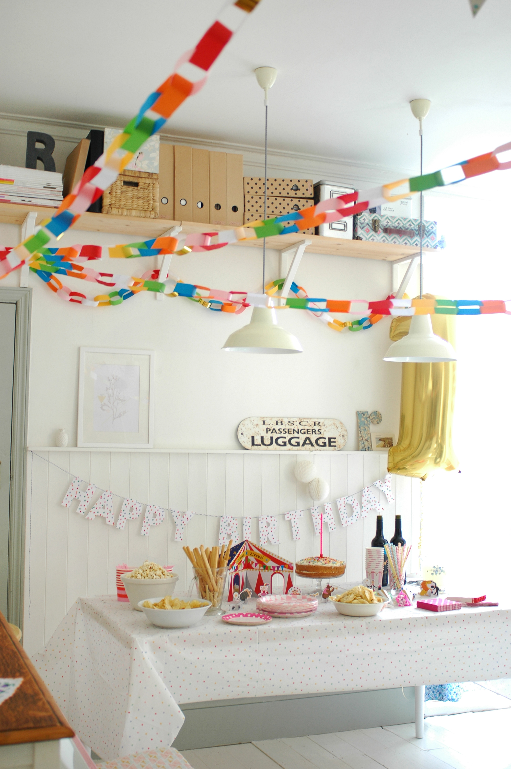
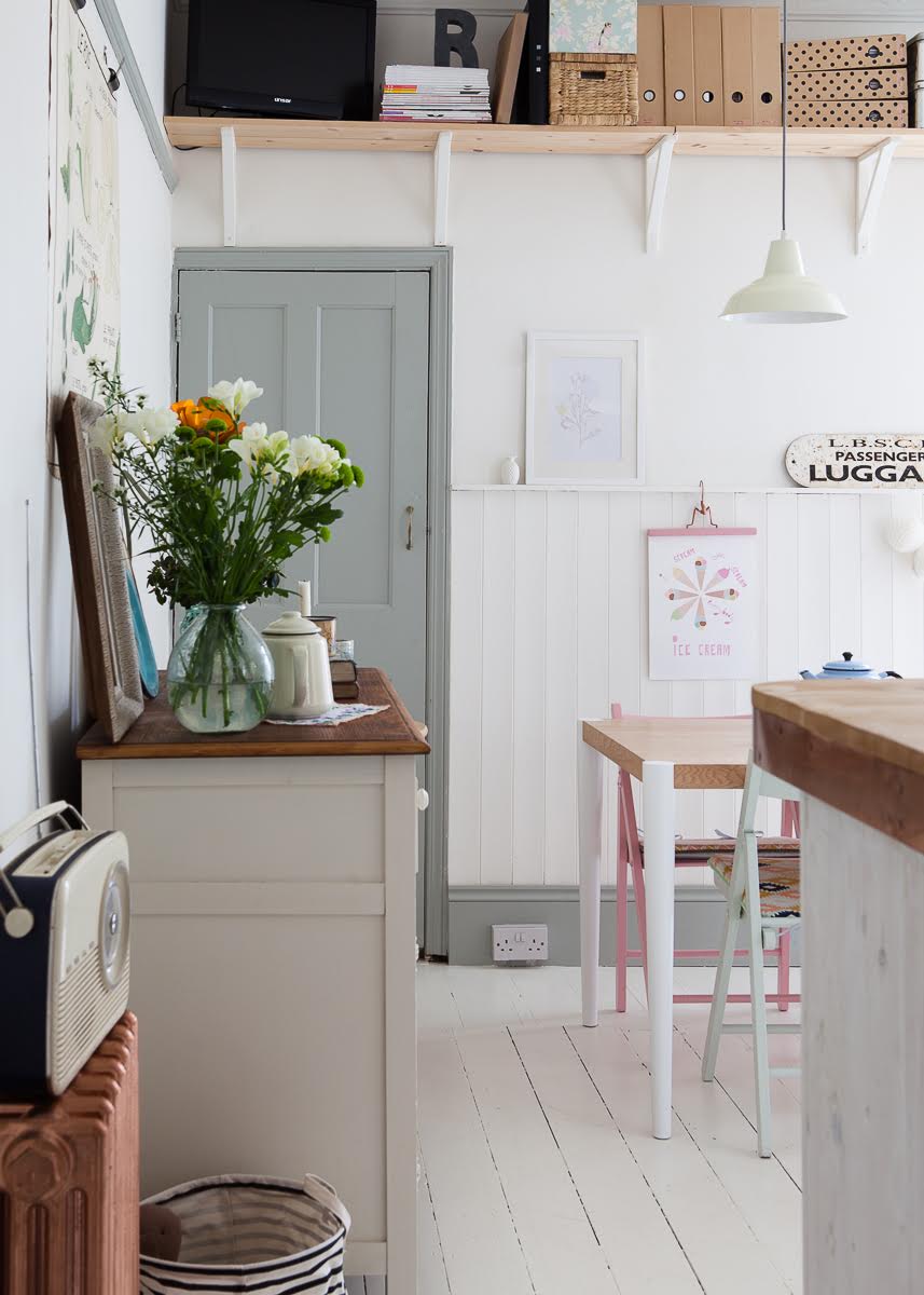
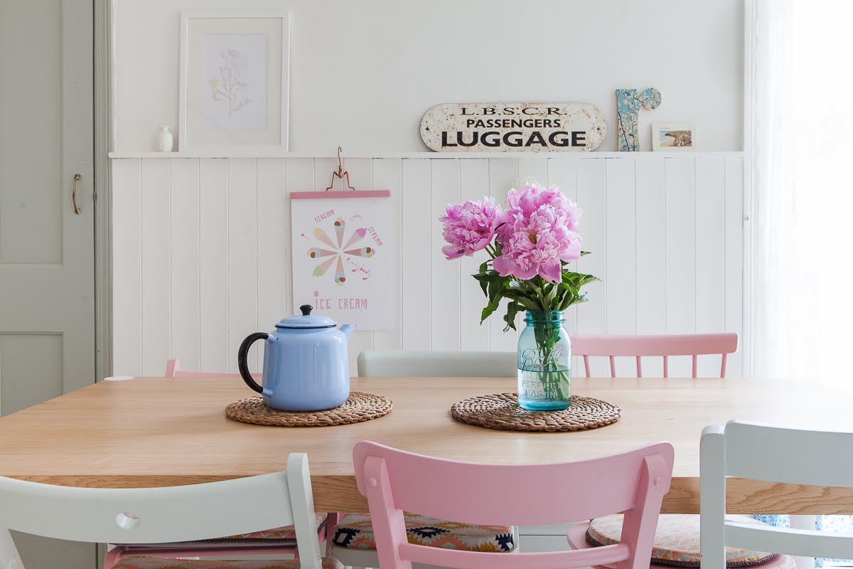
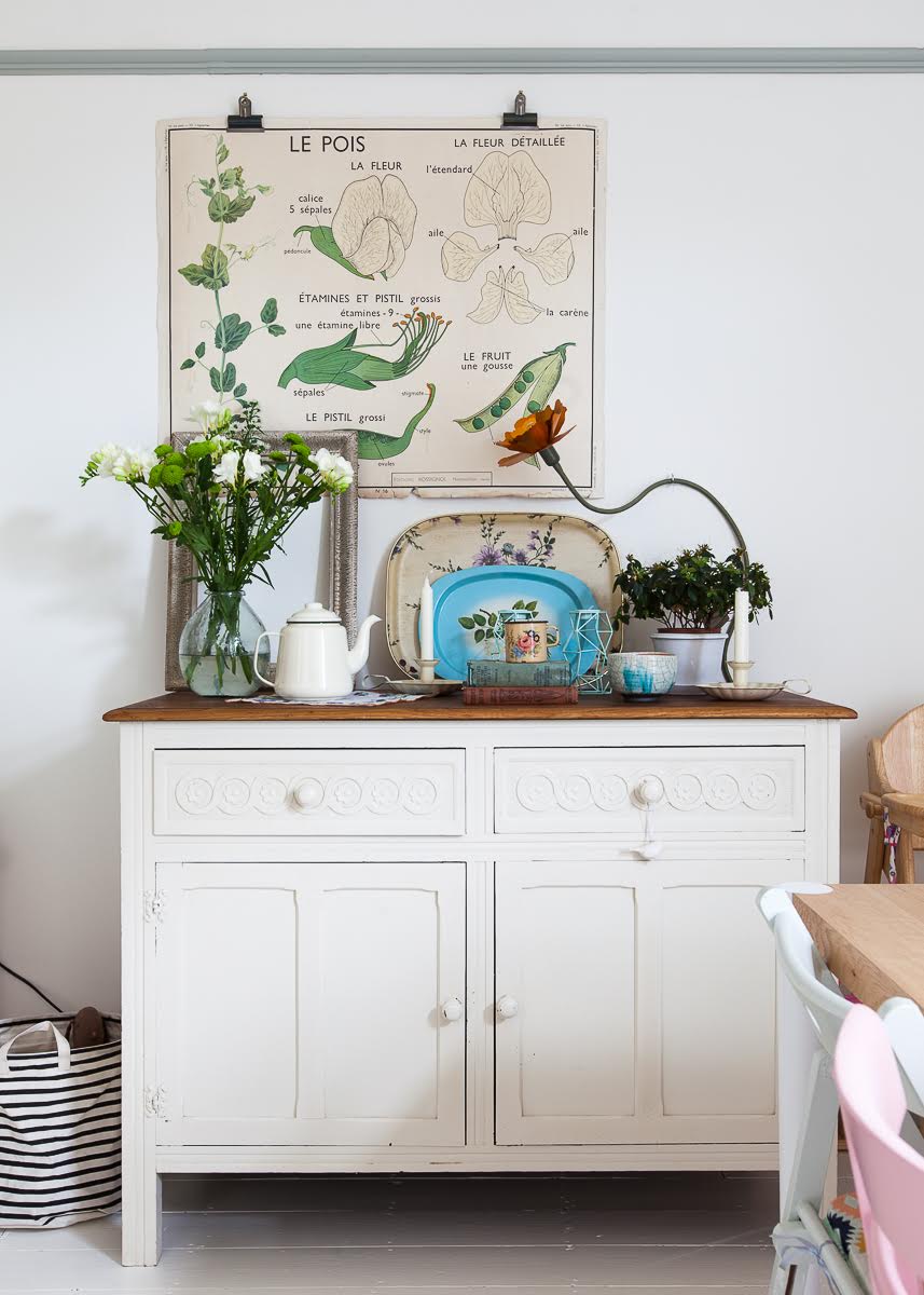
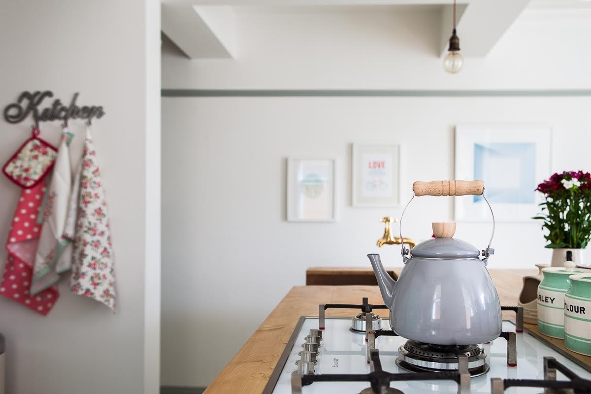
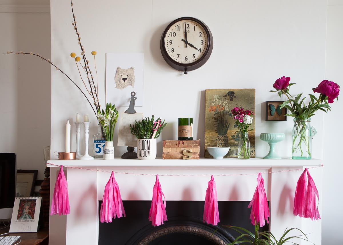
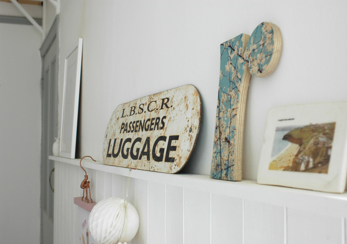
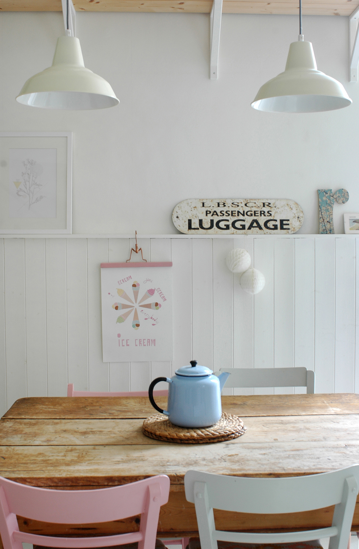
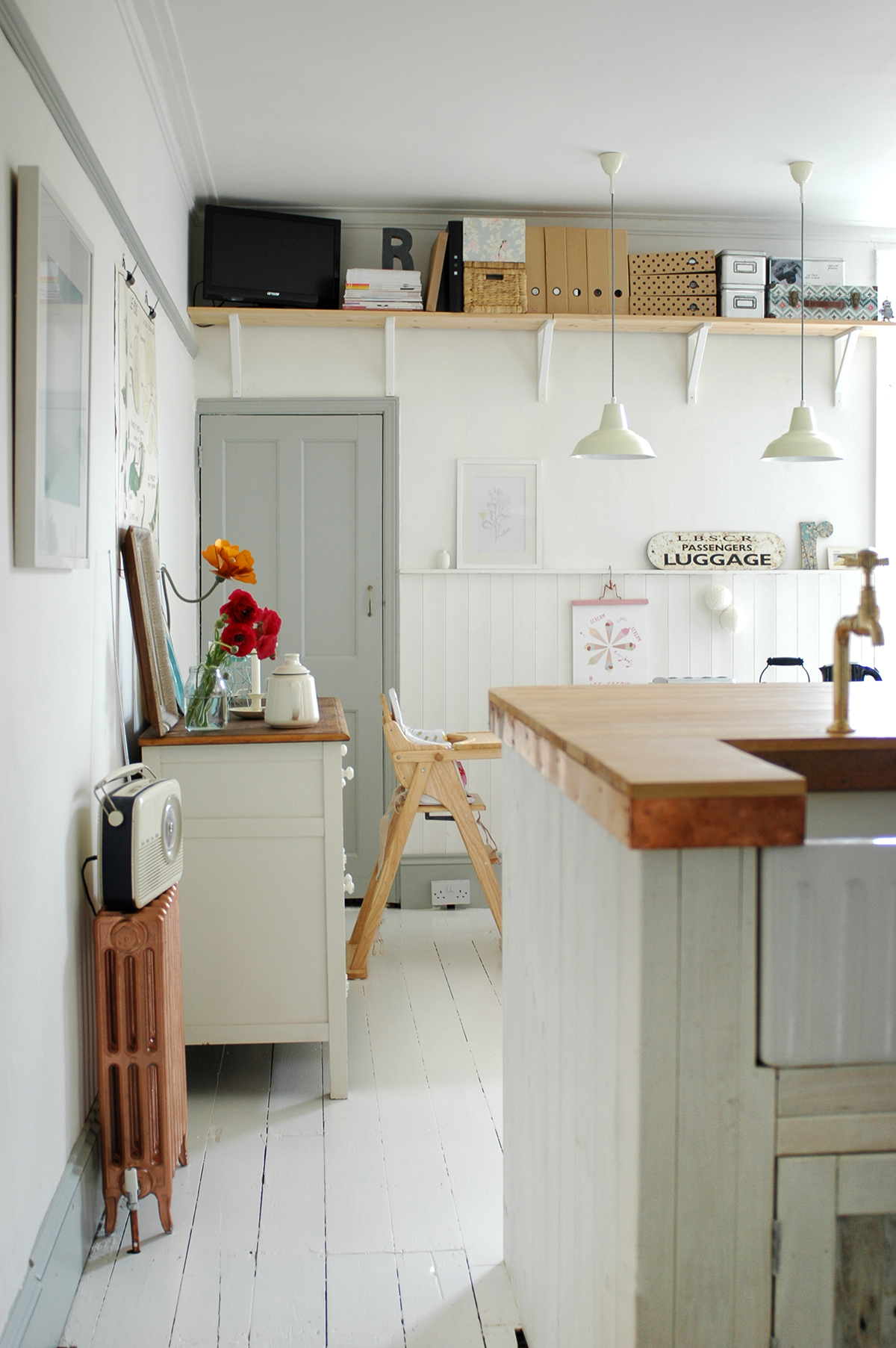
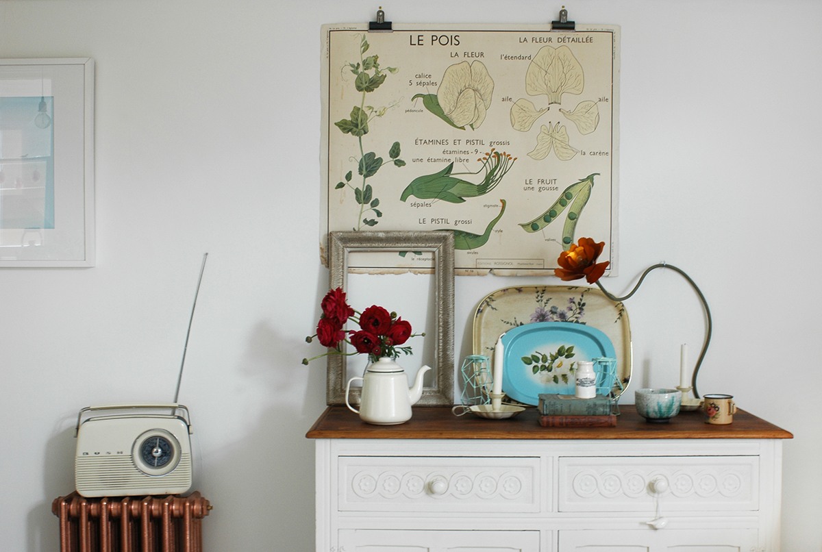
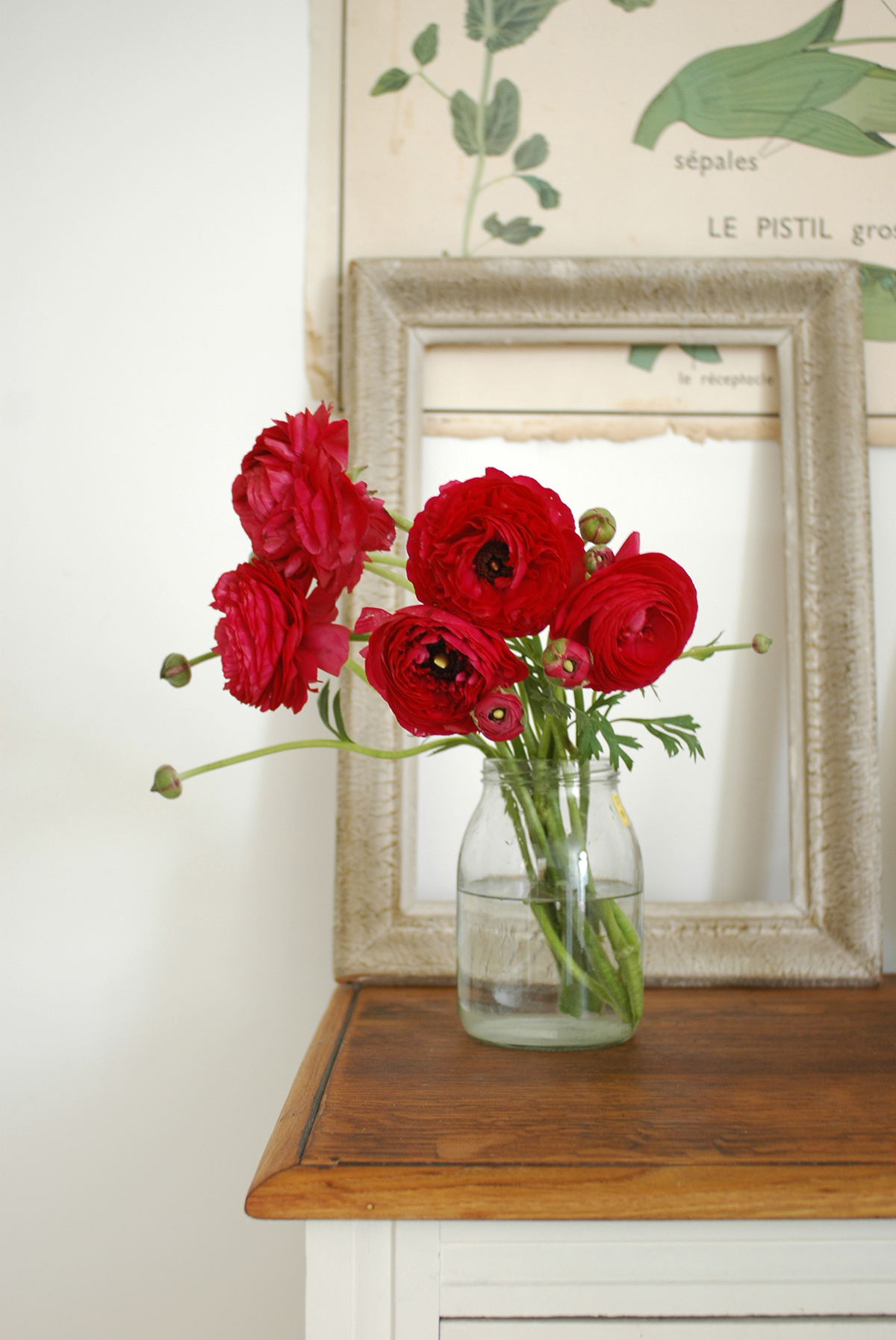
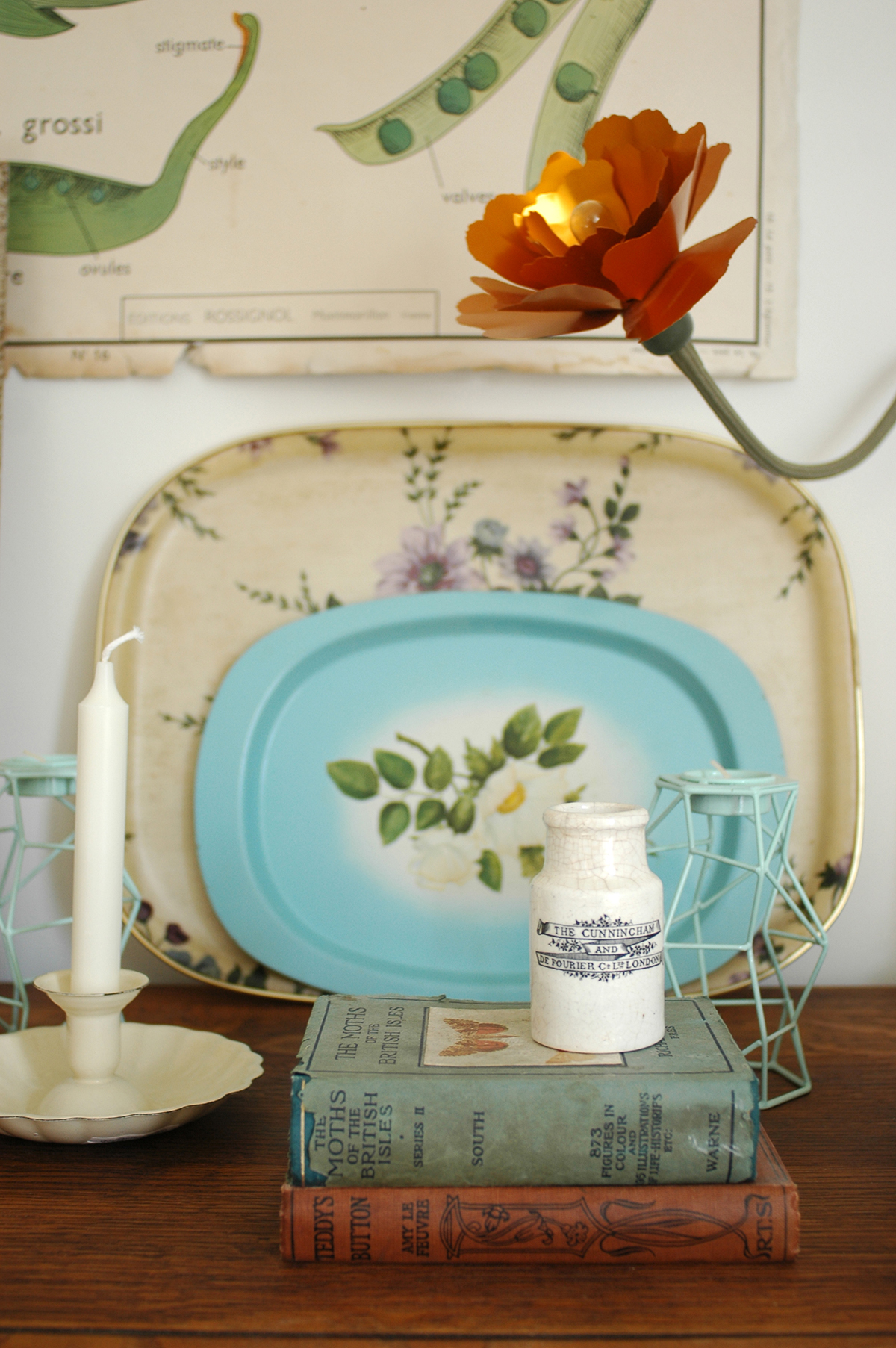
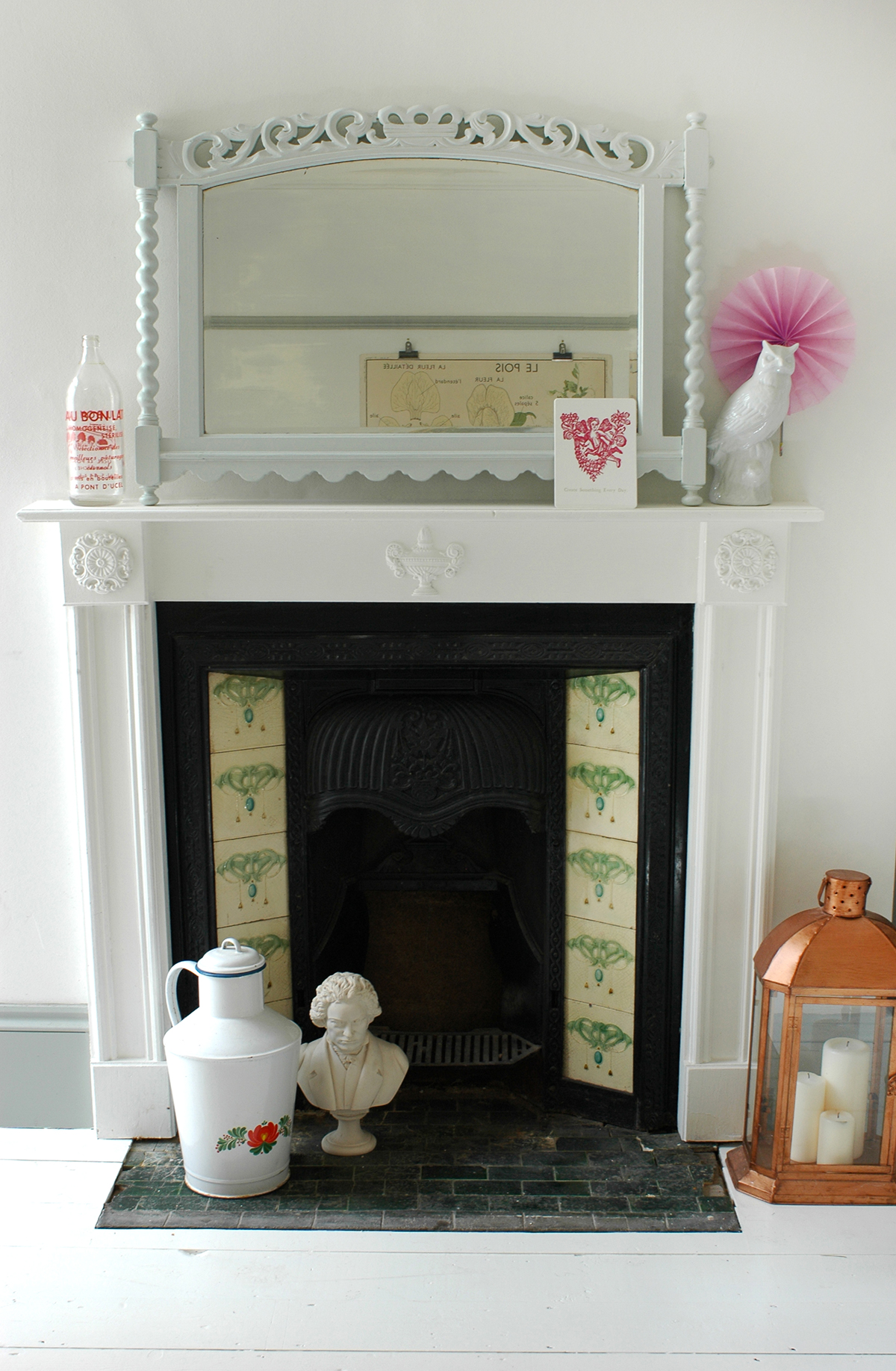
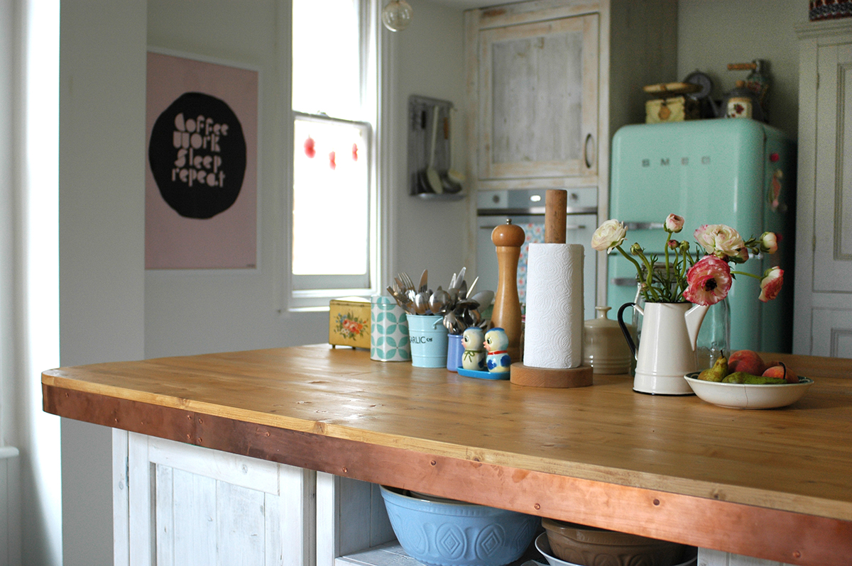
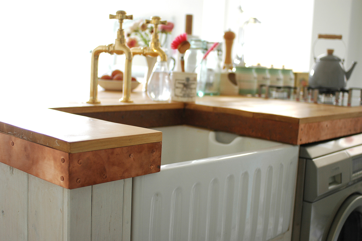
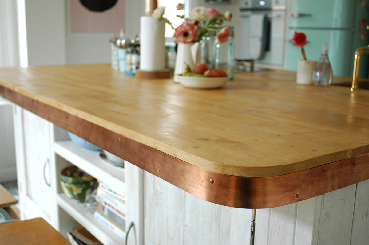
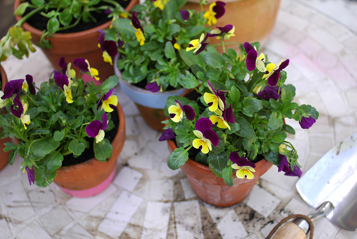
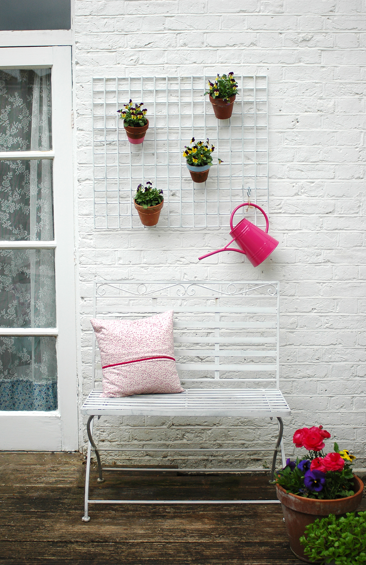
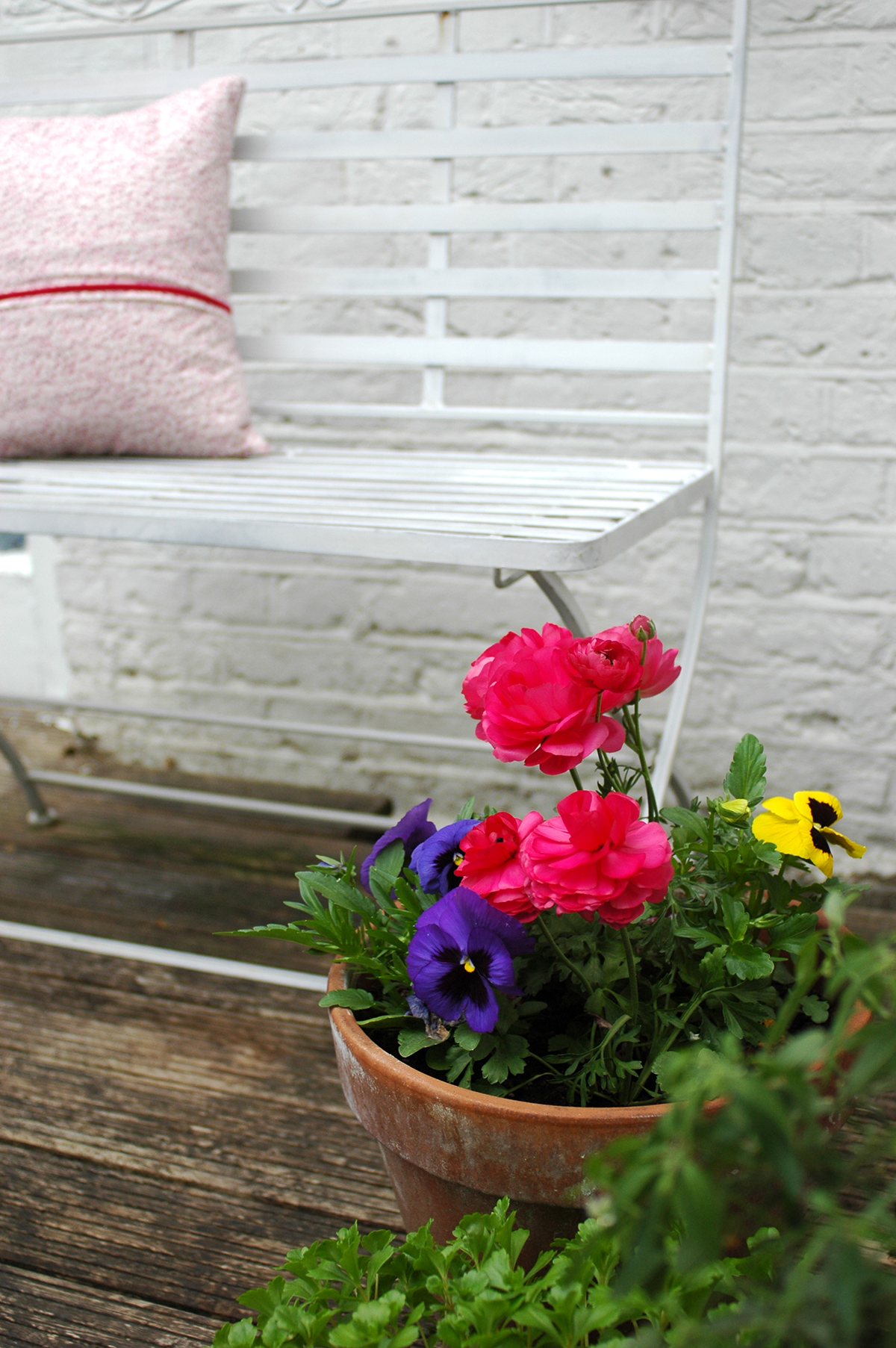
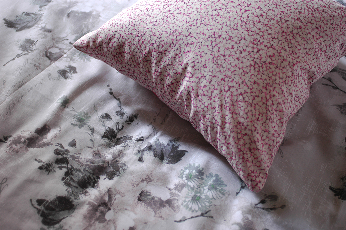
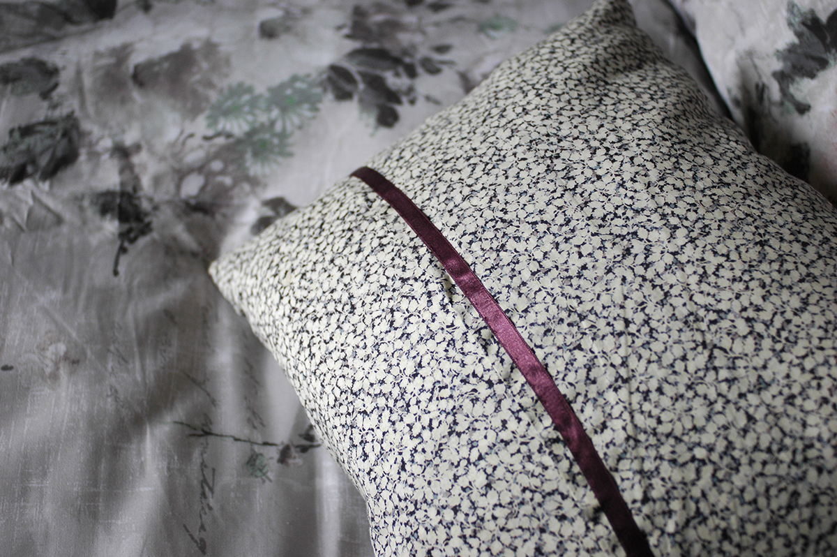
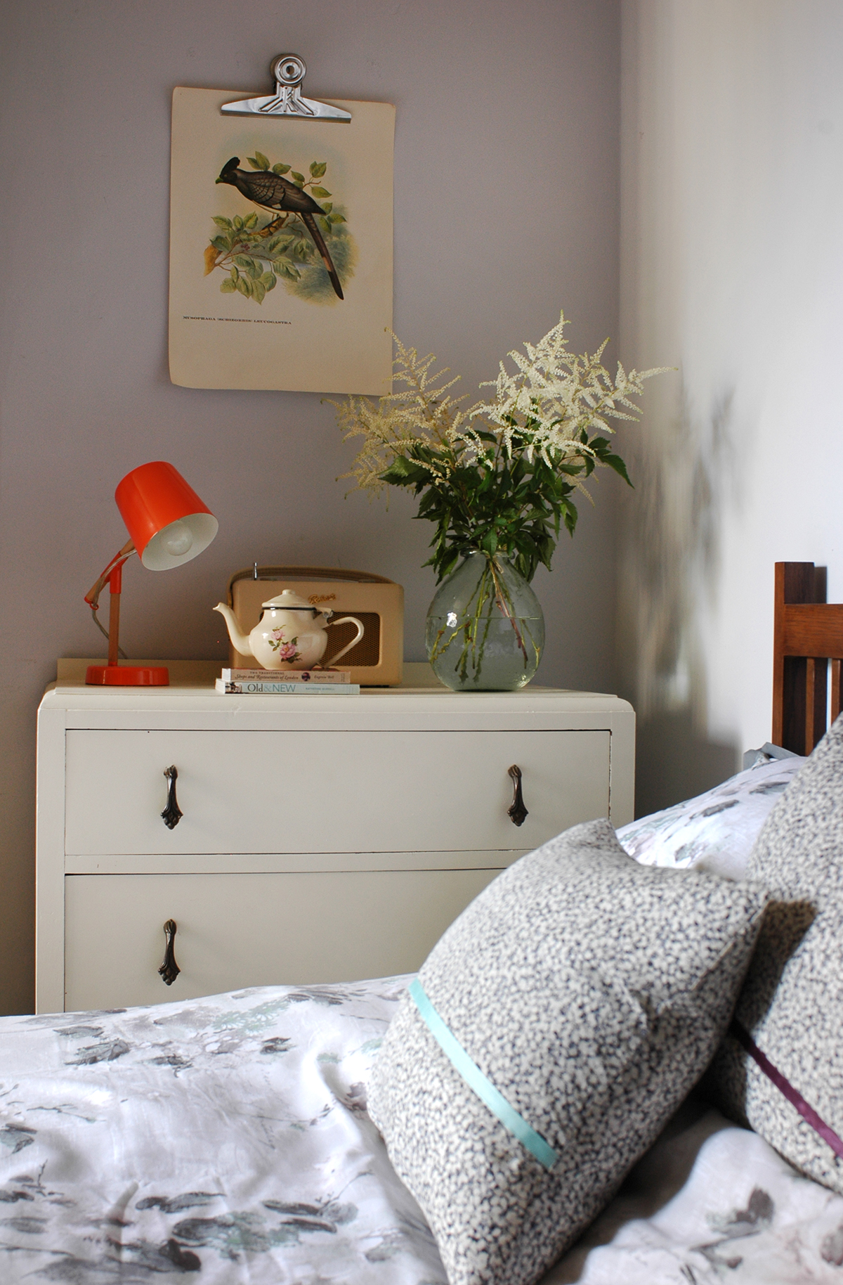
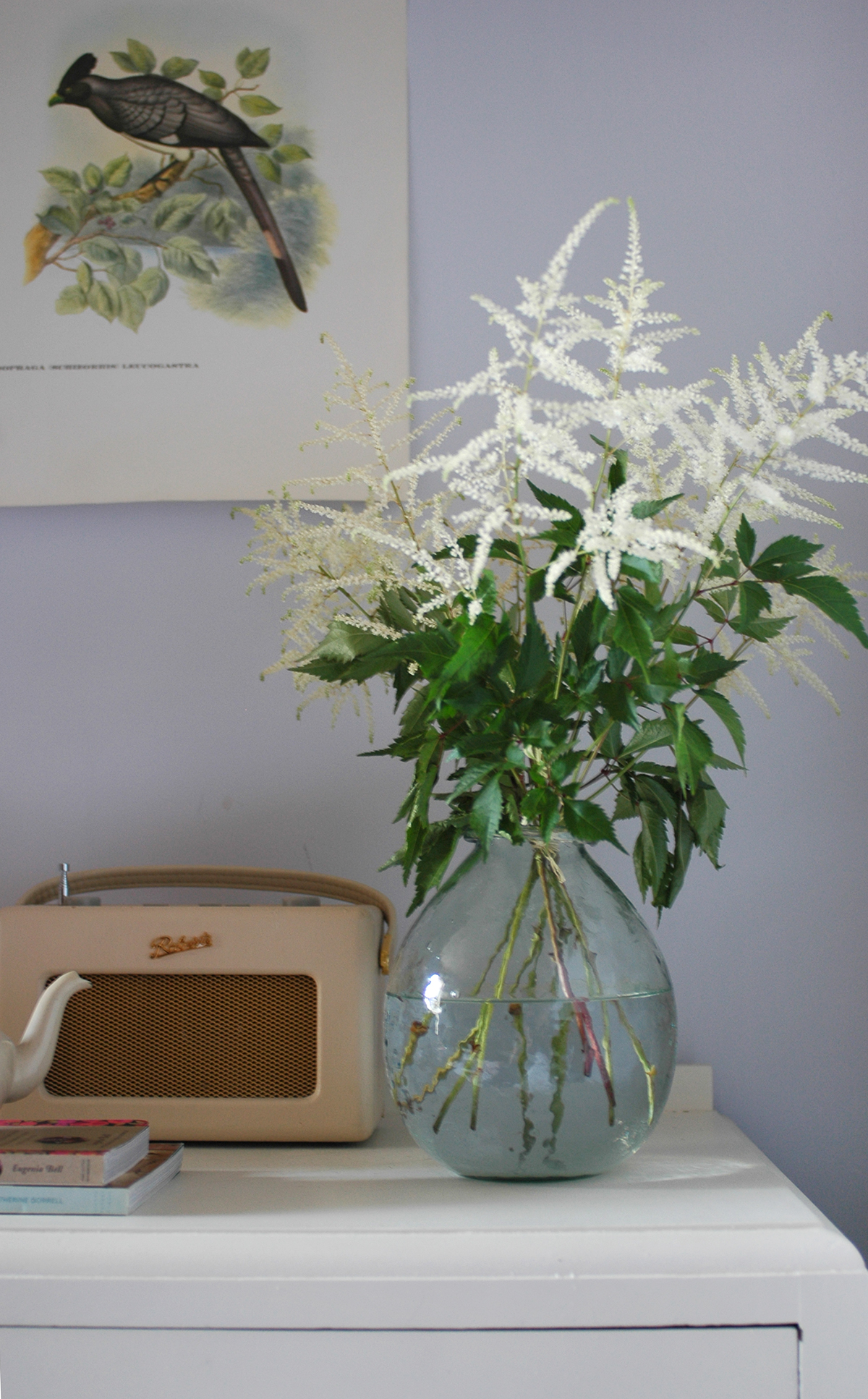
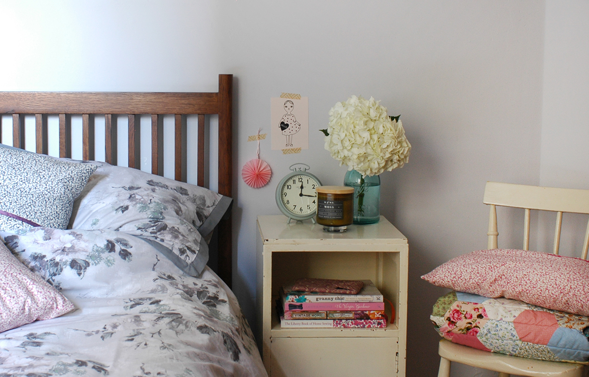
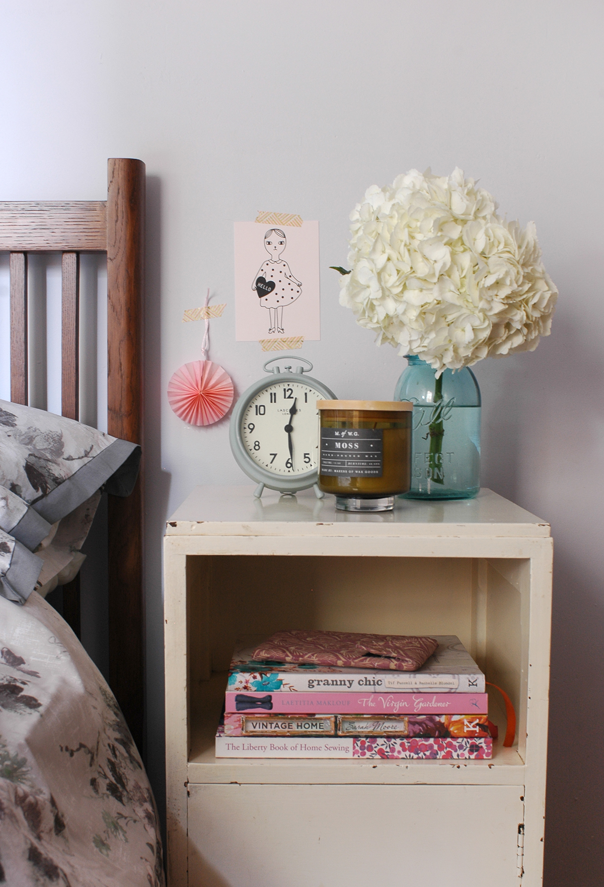
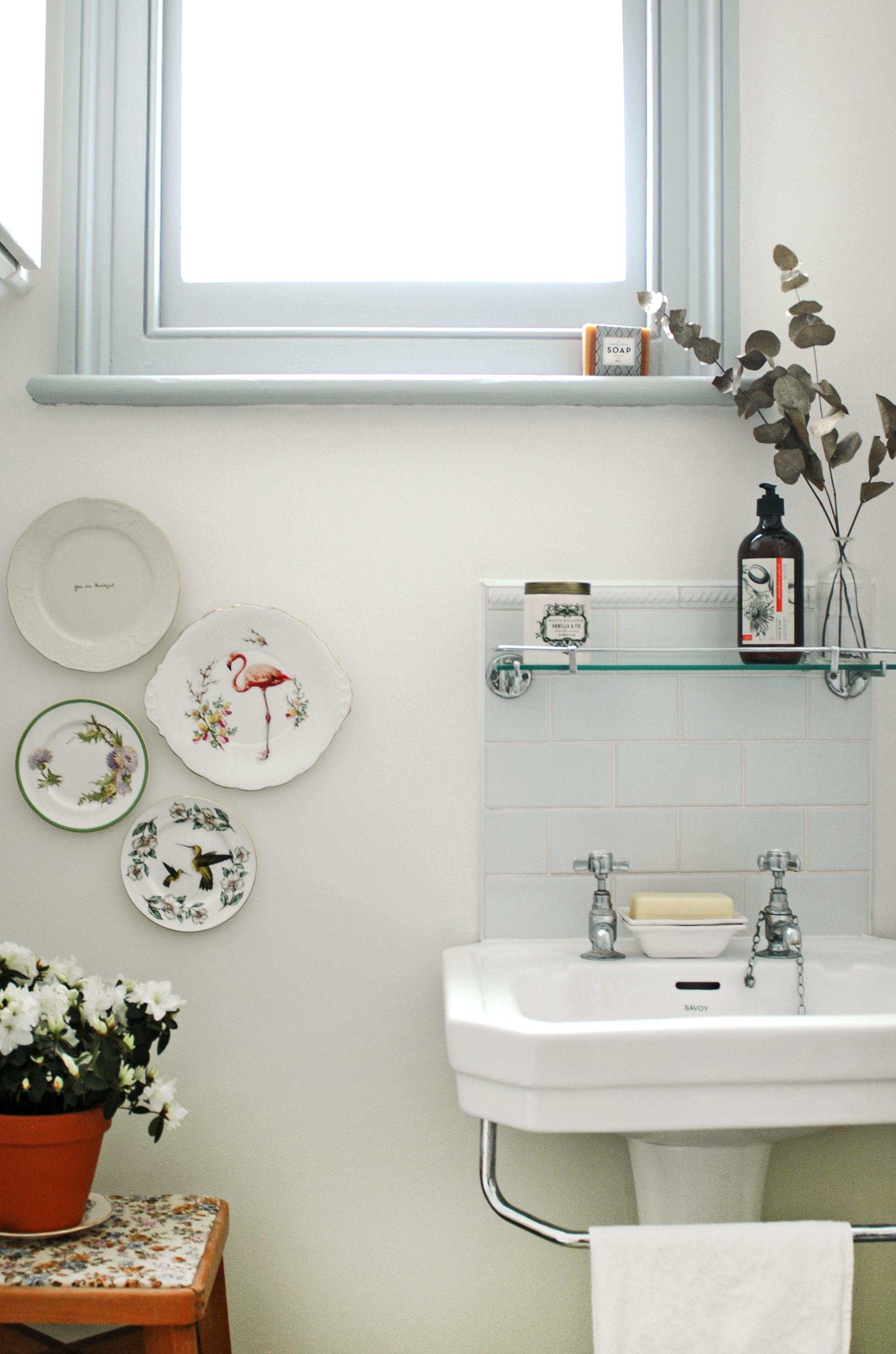
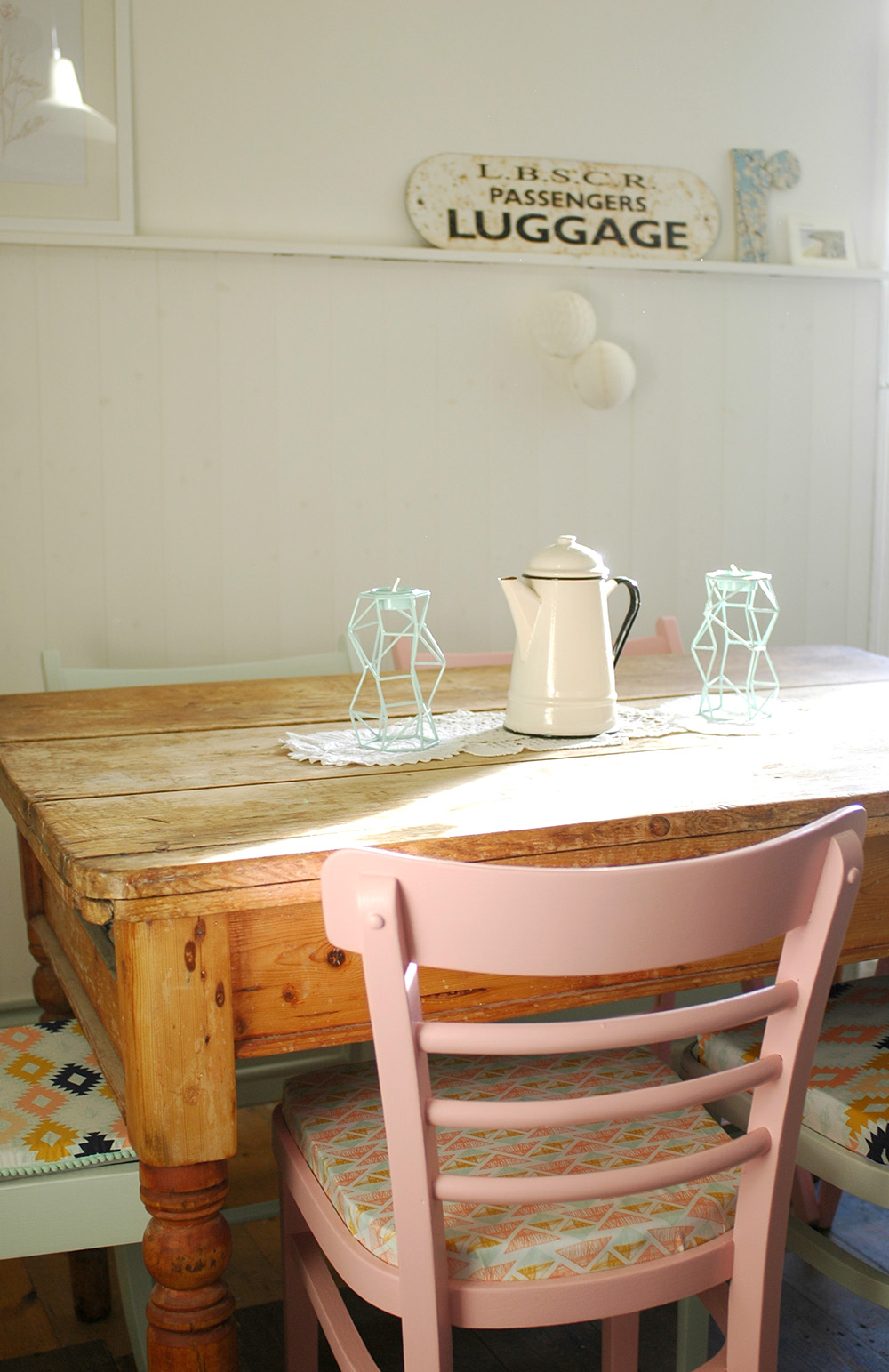
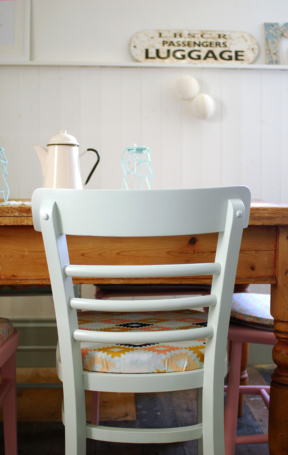
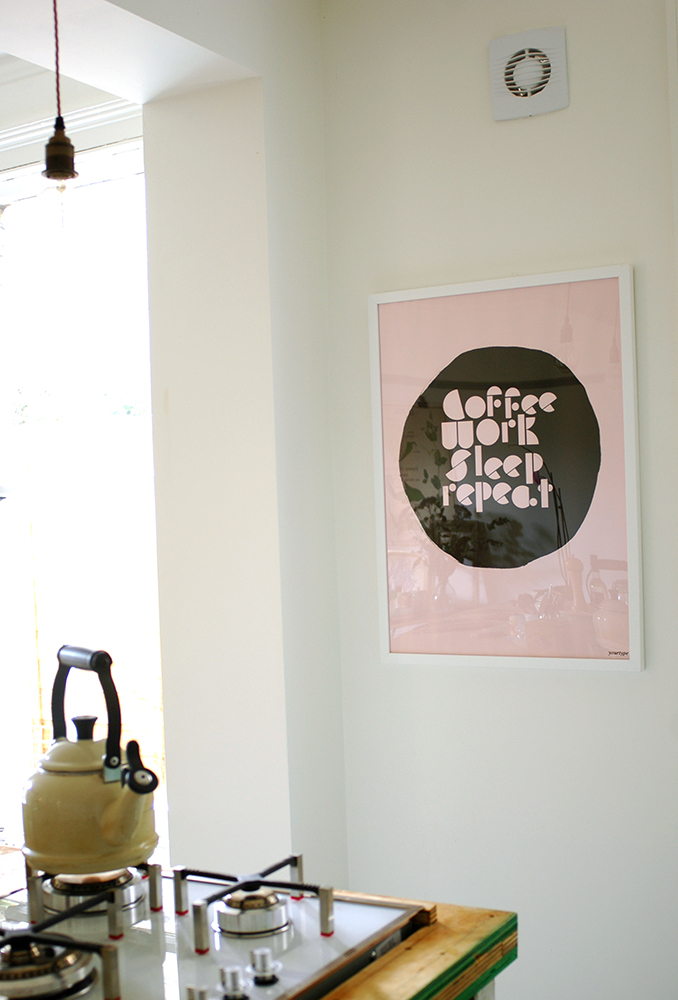
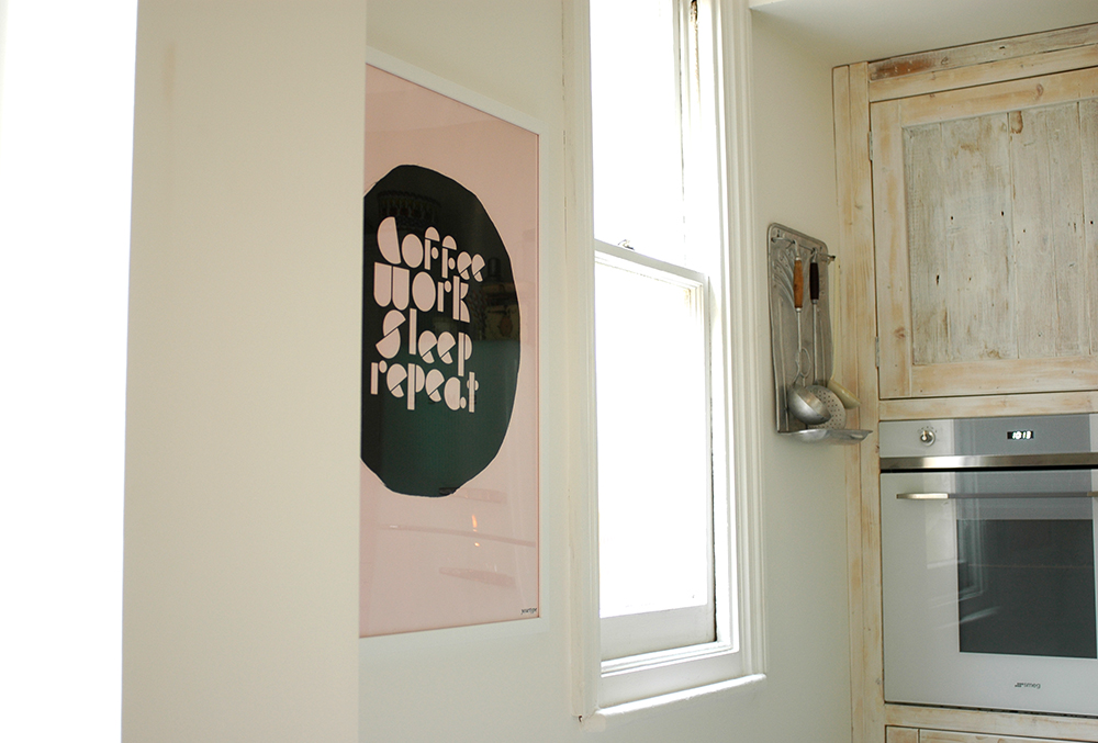
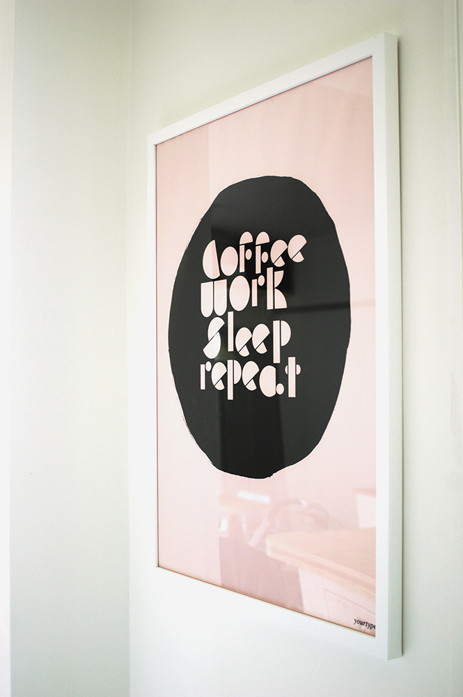
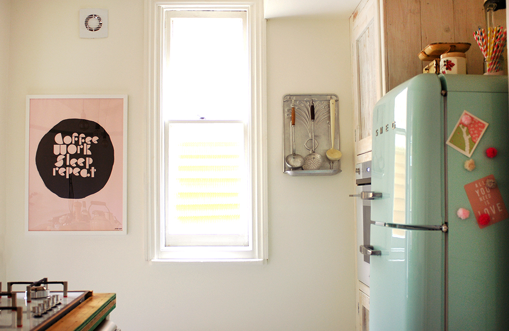
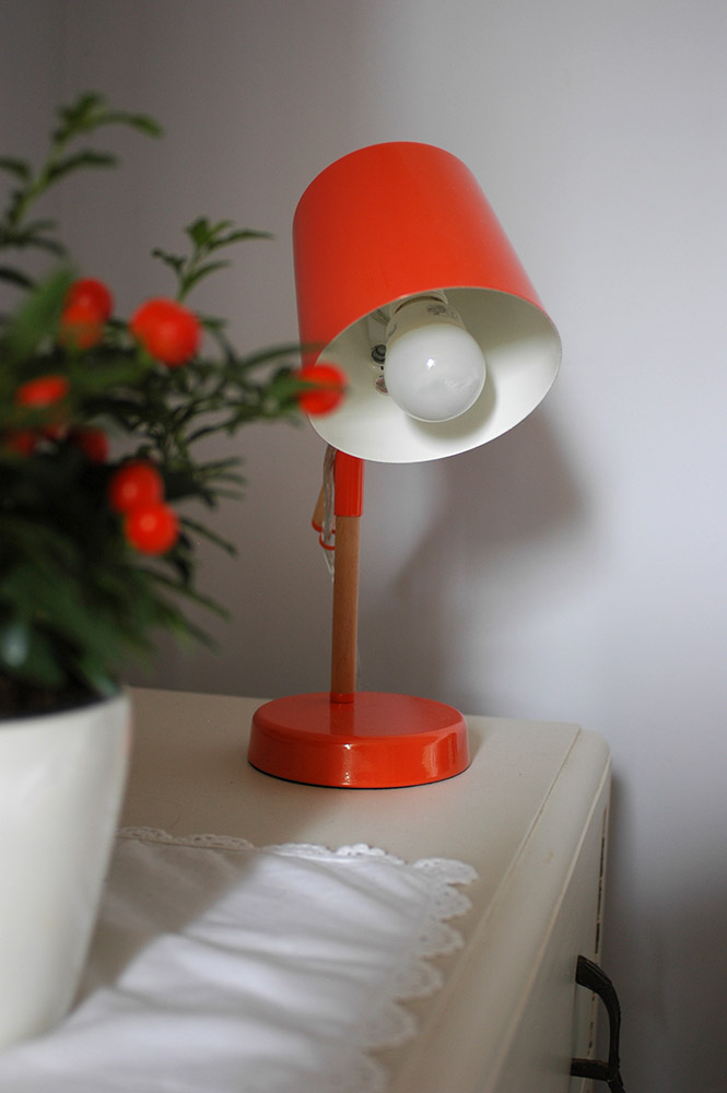
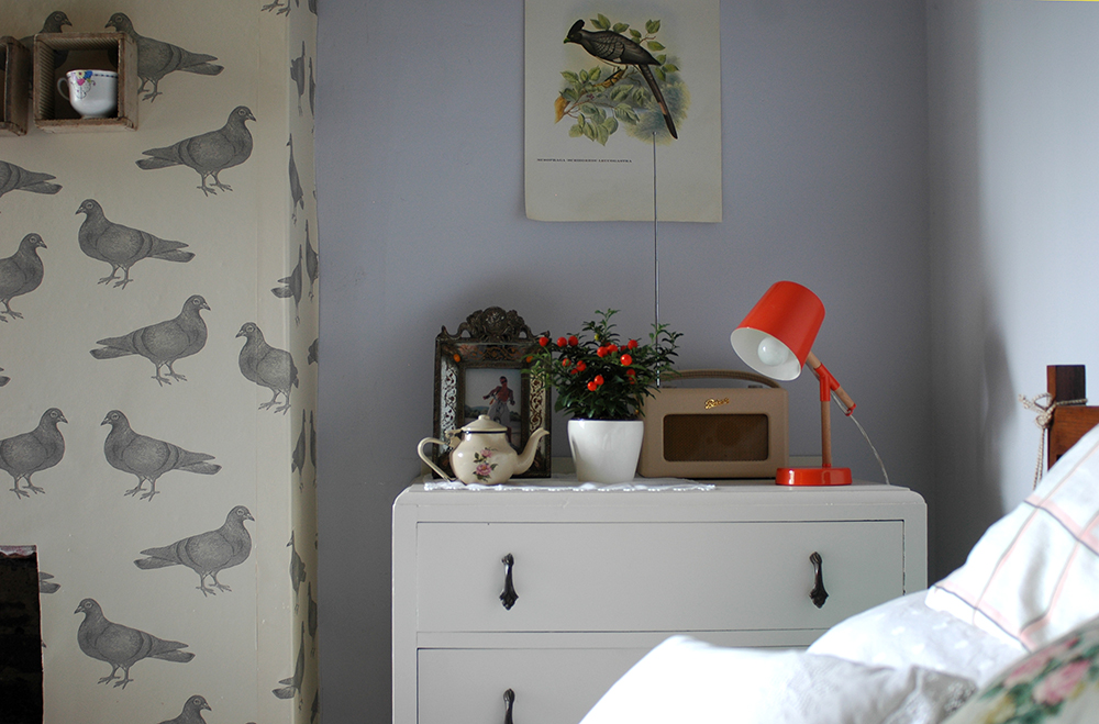
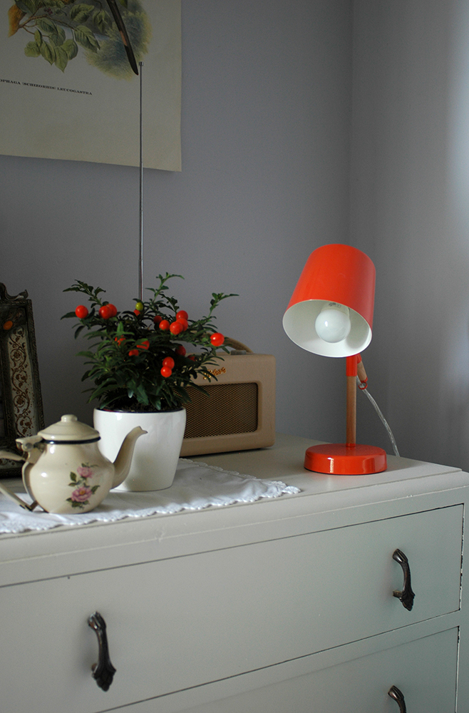
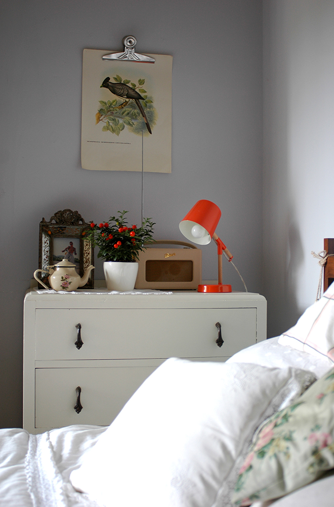
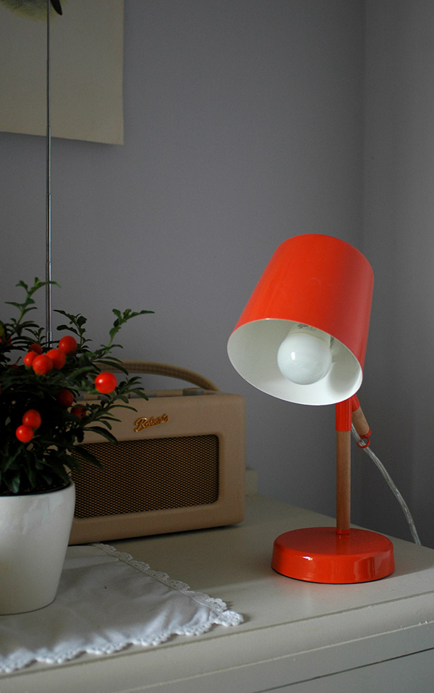
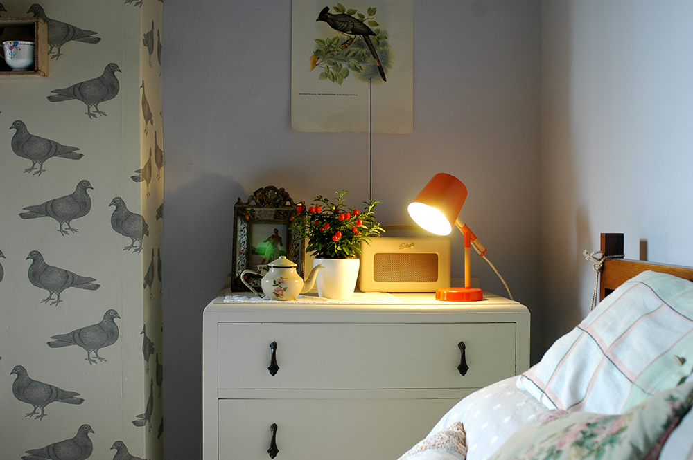
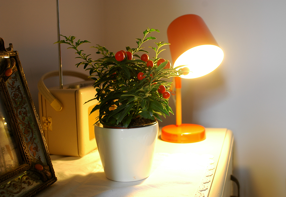
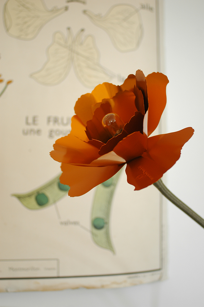
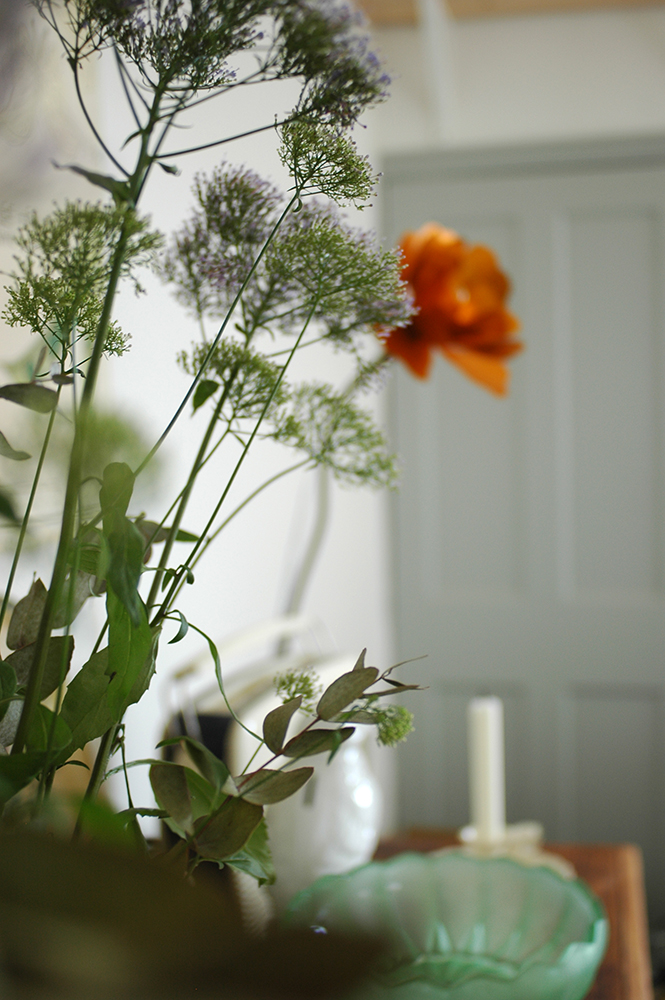
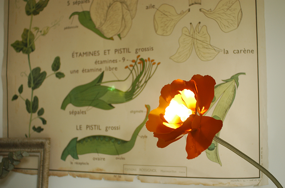
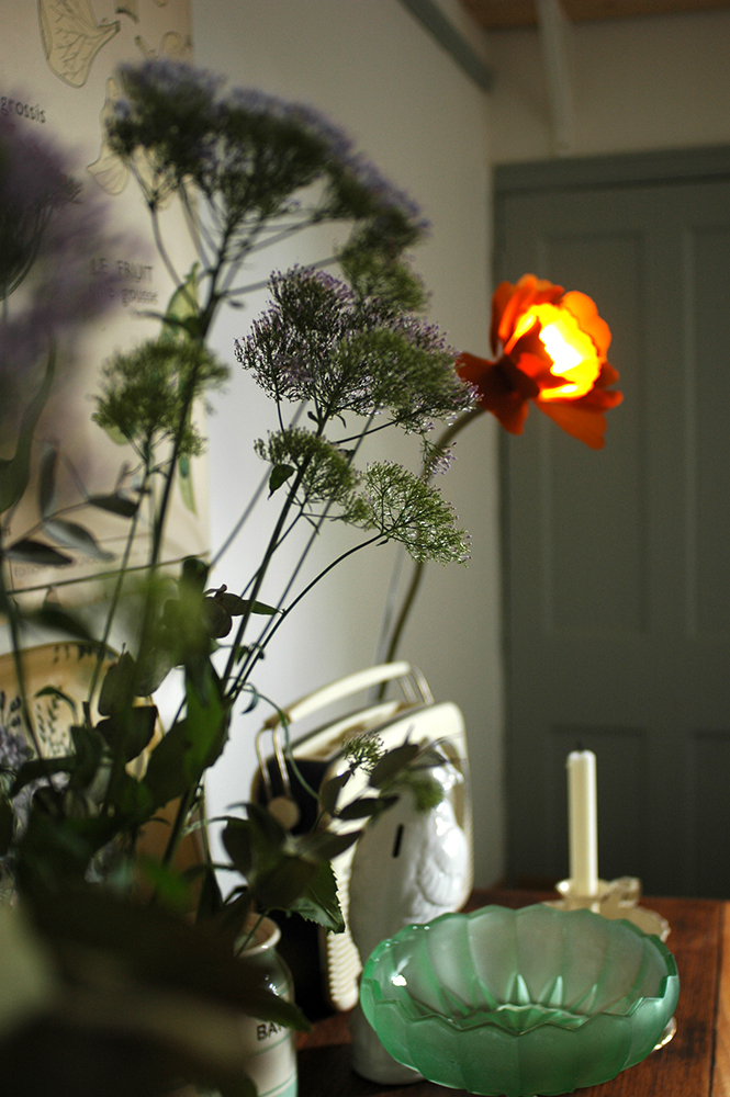
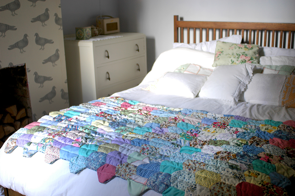
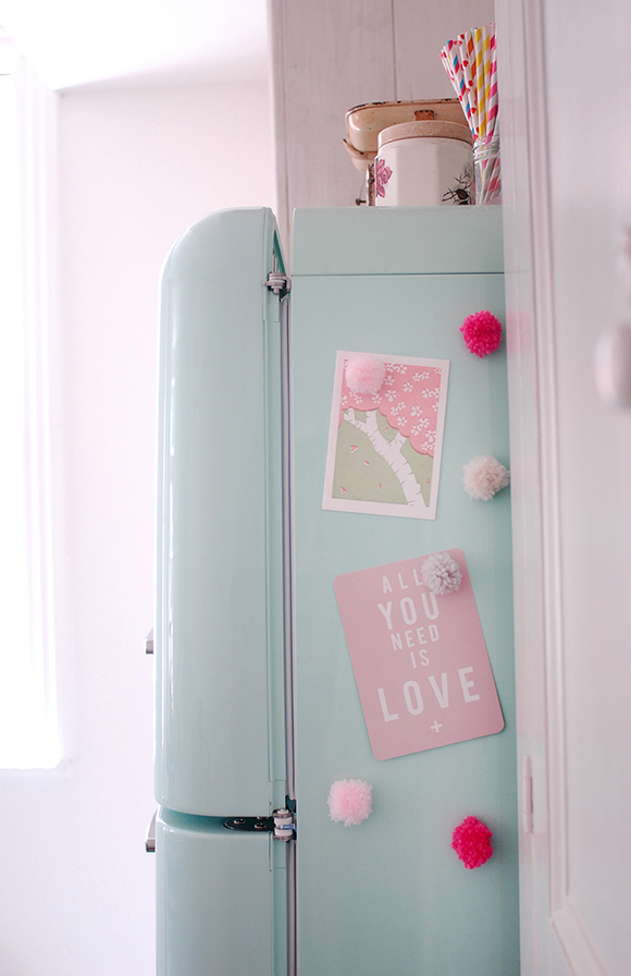
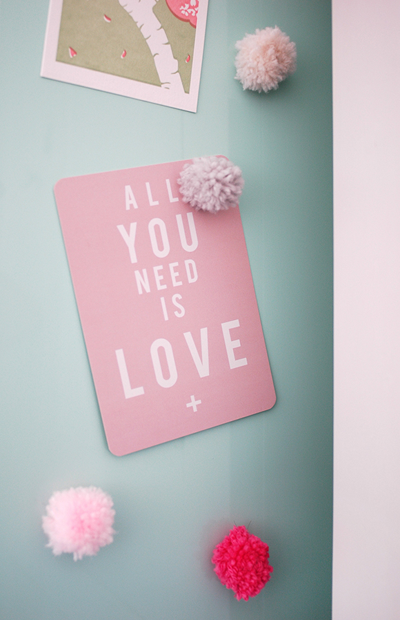
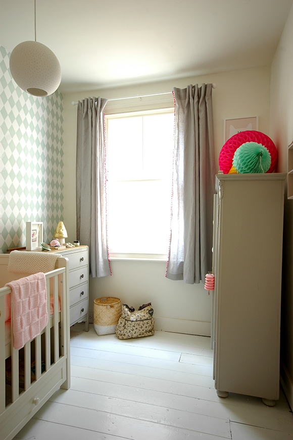
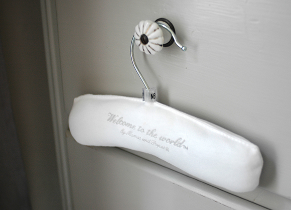
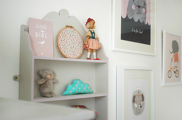
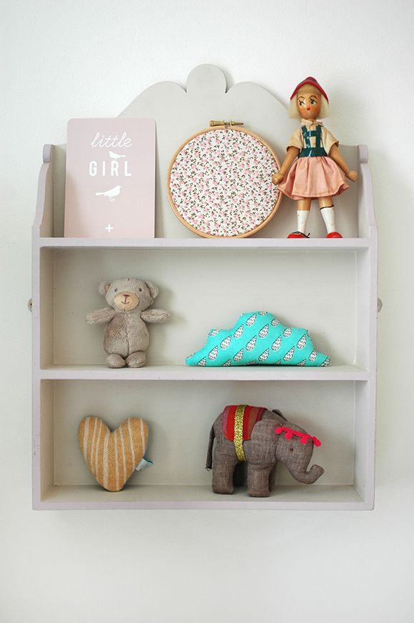
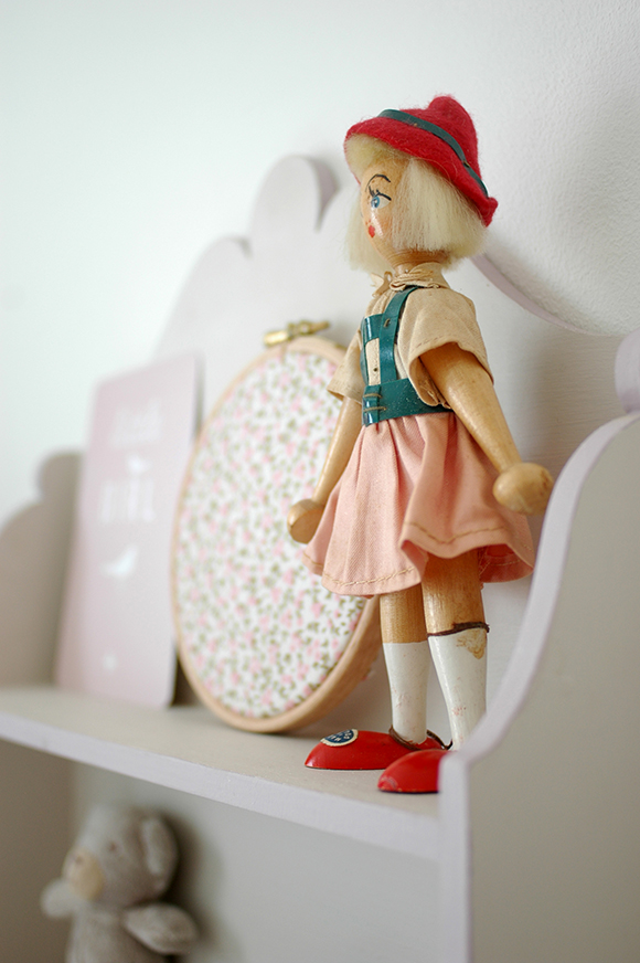
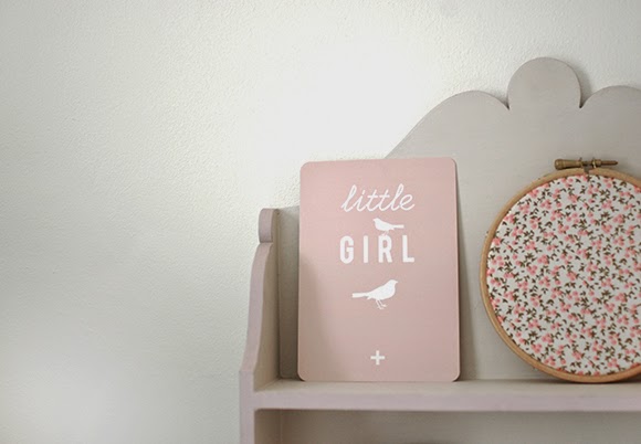
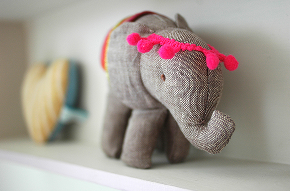
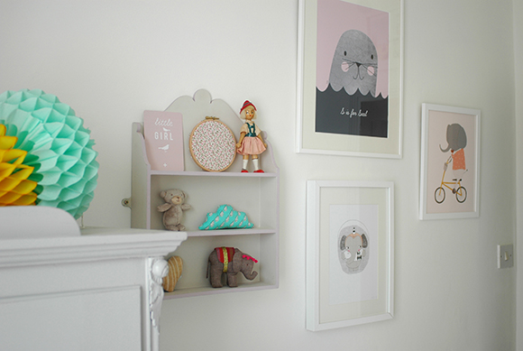
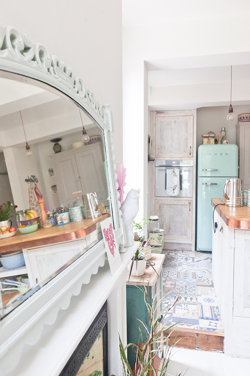
I recently had a photographer from made.com come over and take some pictures of our house.  I find it really interesting to see how different photographers work and how they capture the same space. These images are quite different from the ones taken for Apartment Therapy, but equally as lovely I think.  

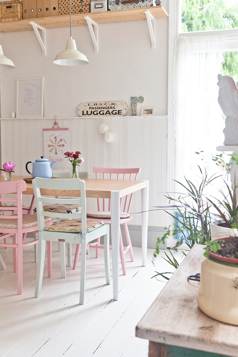
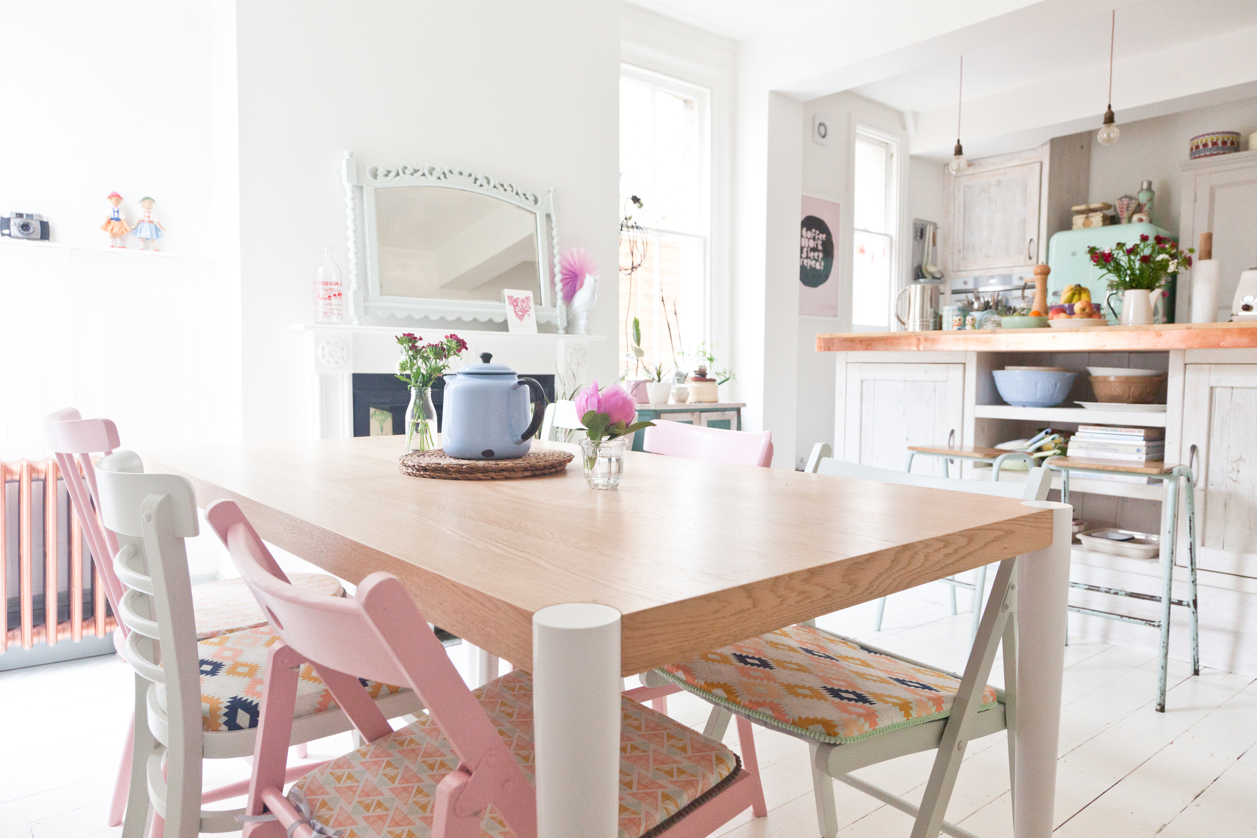
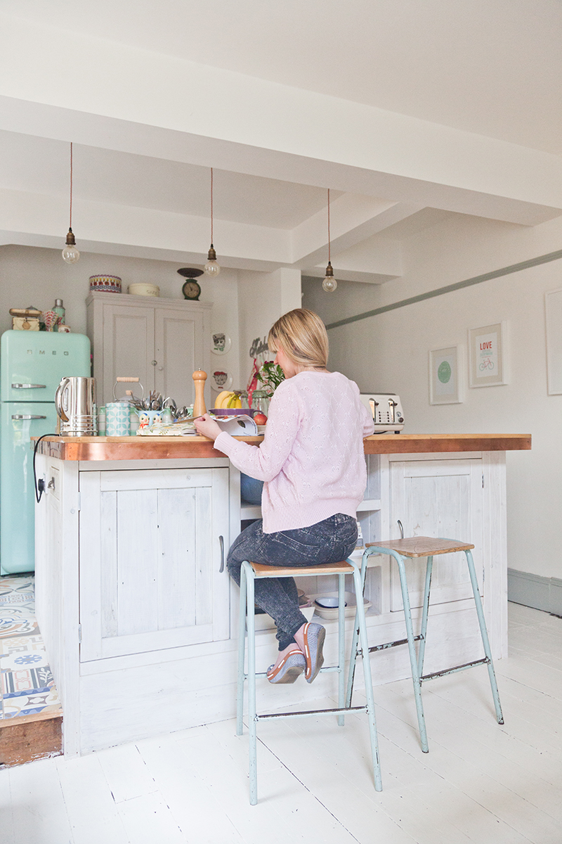
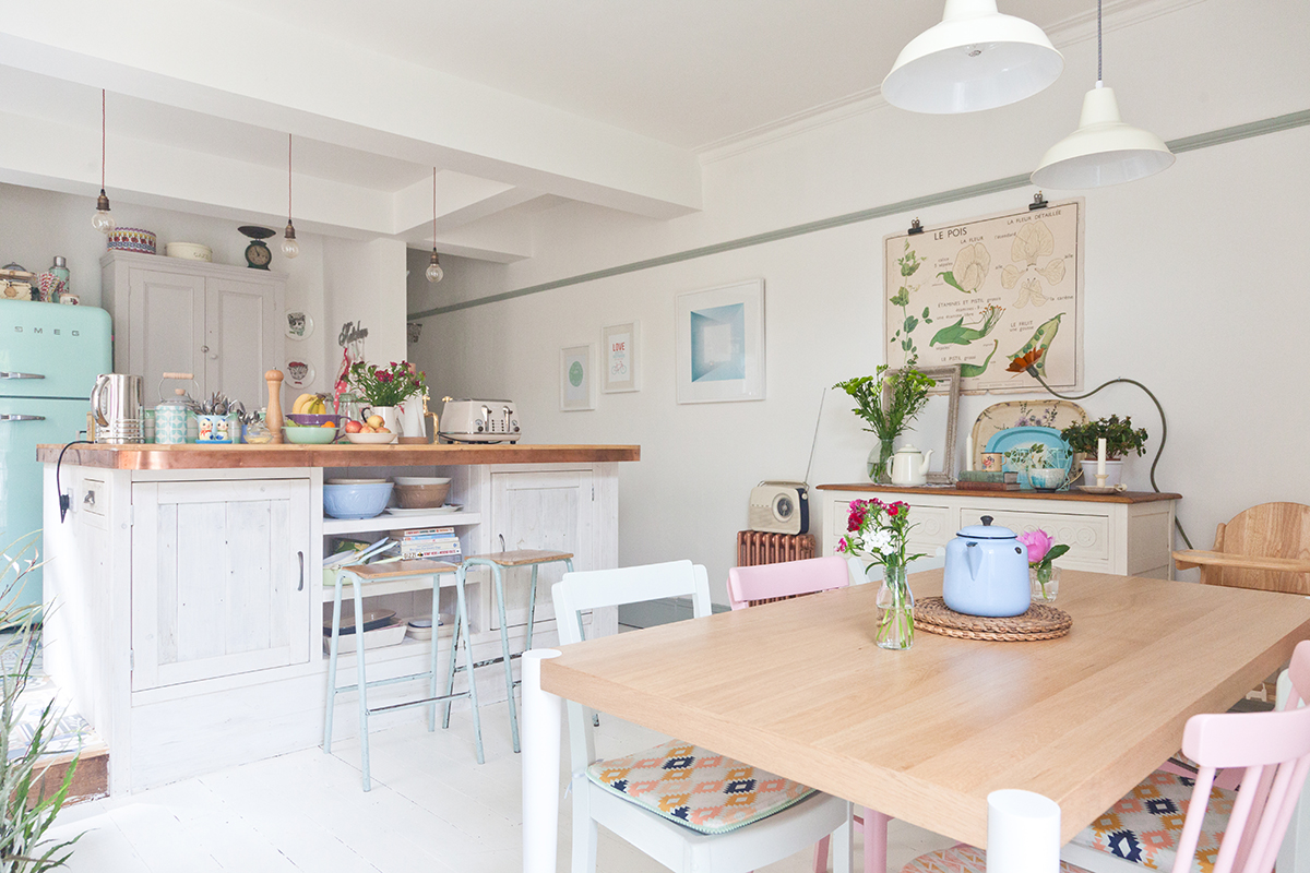
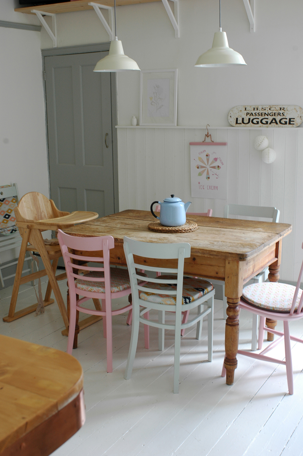
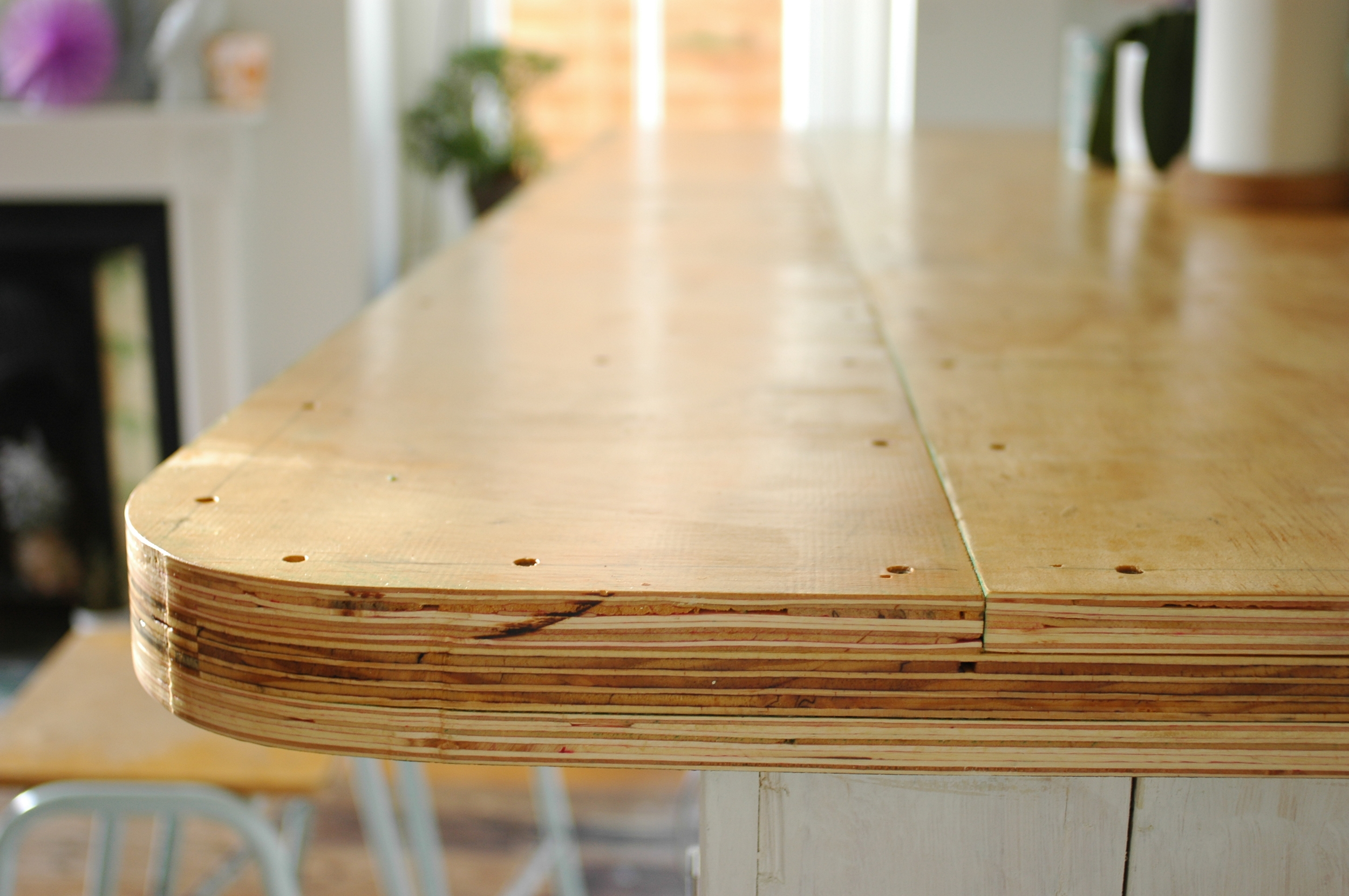
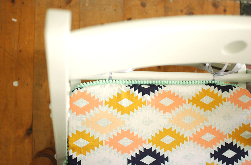
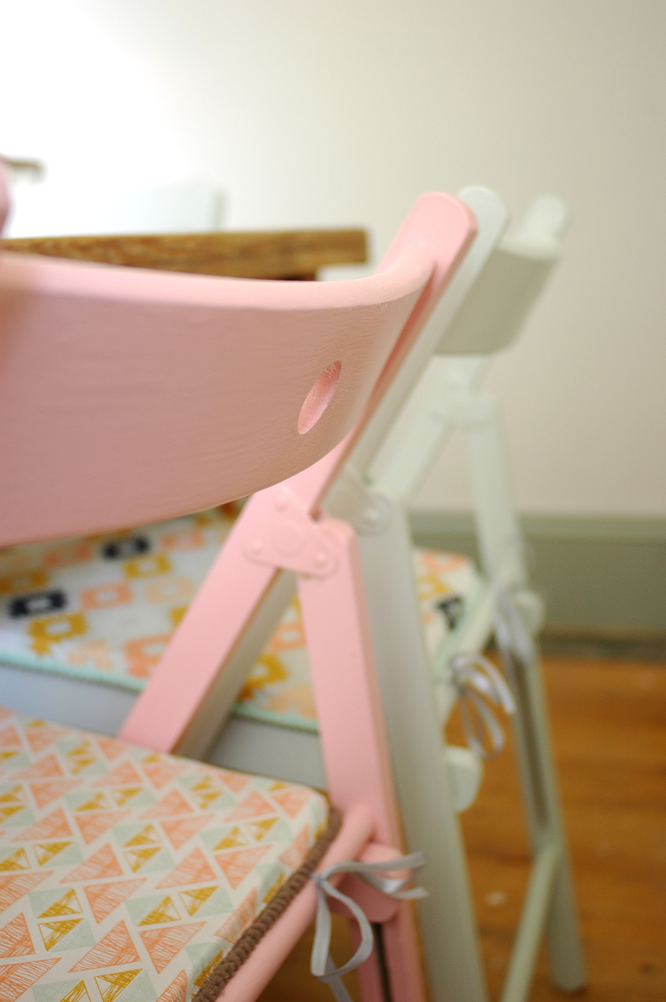
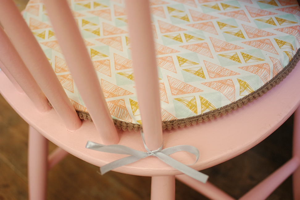
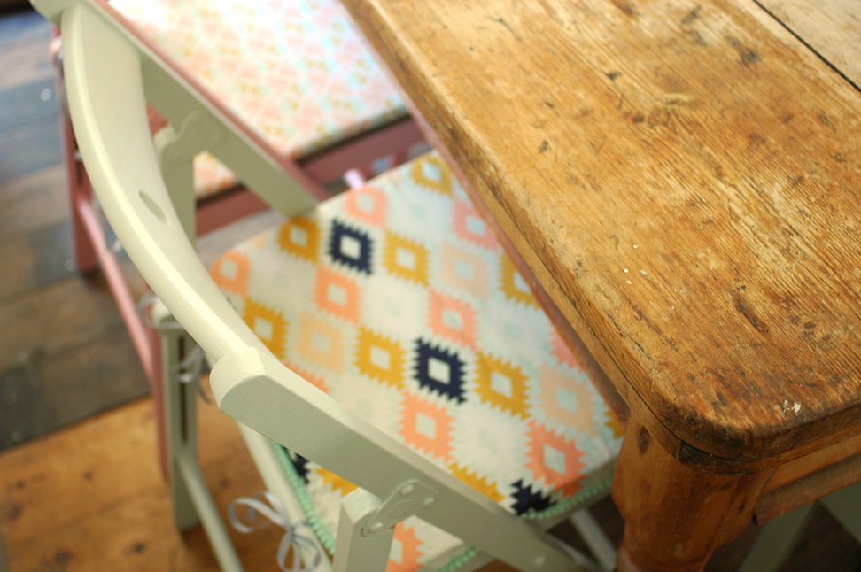
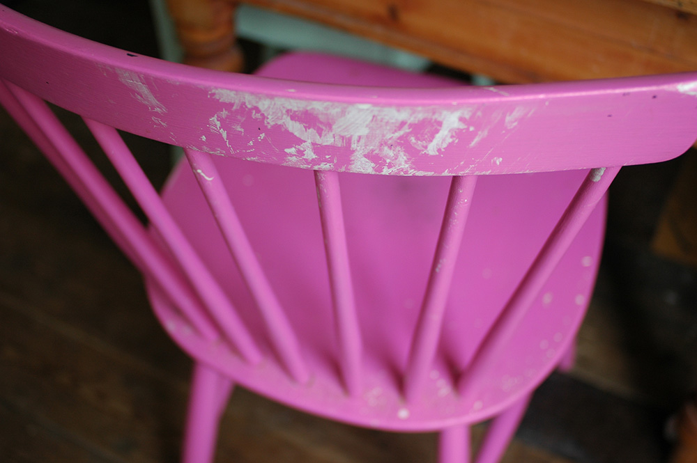
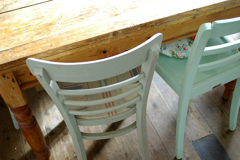
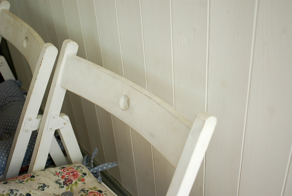
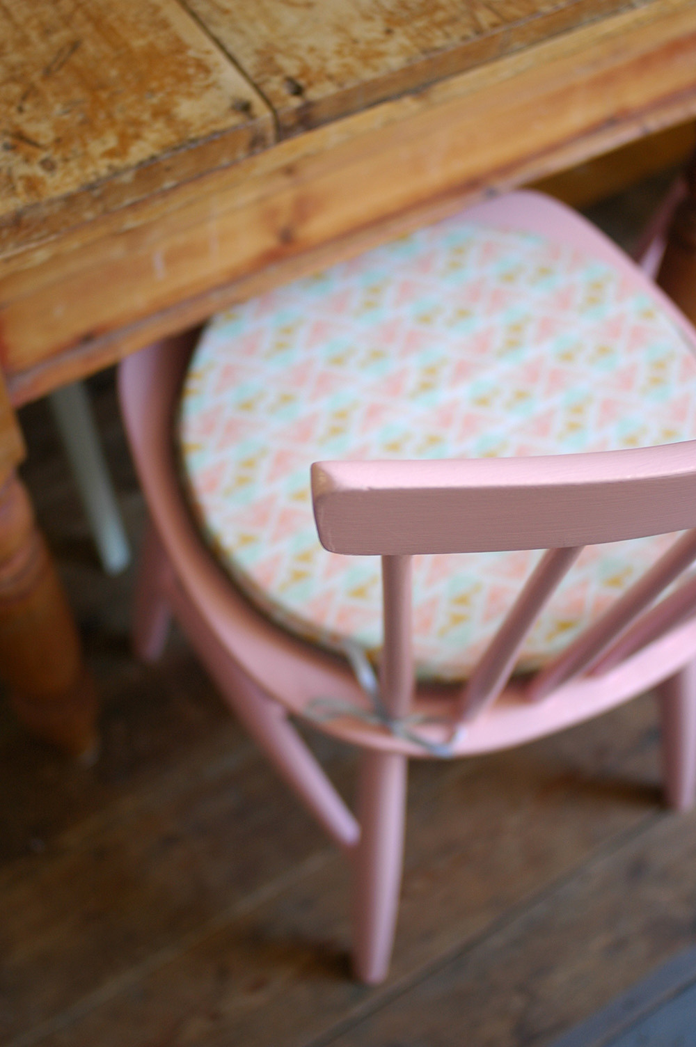
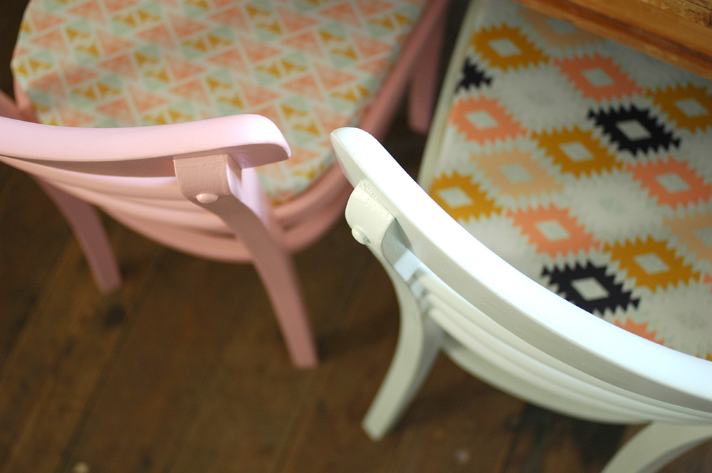
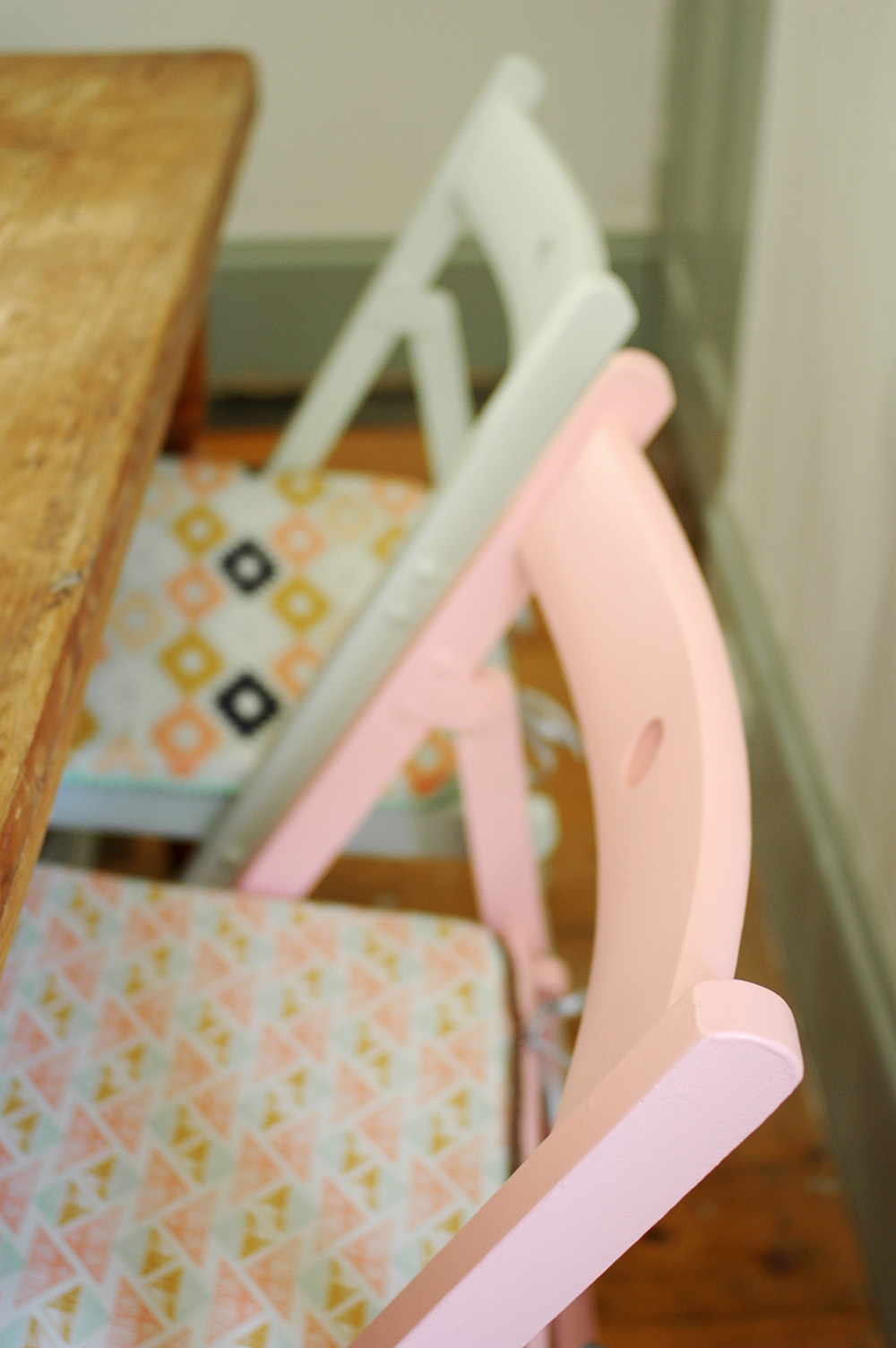
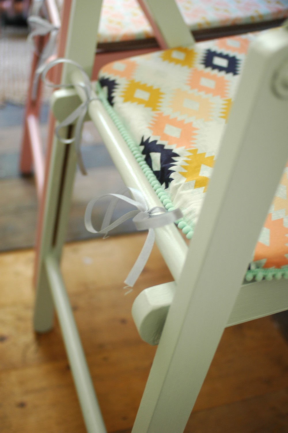
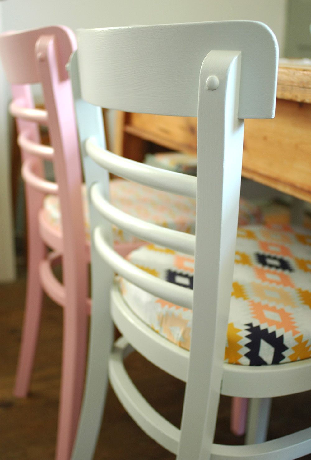
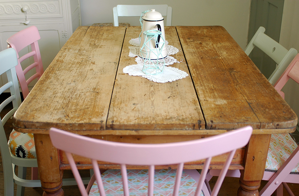
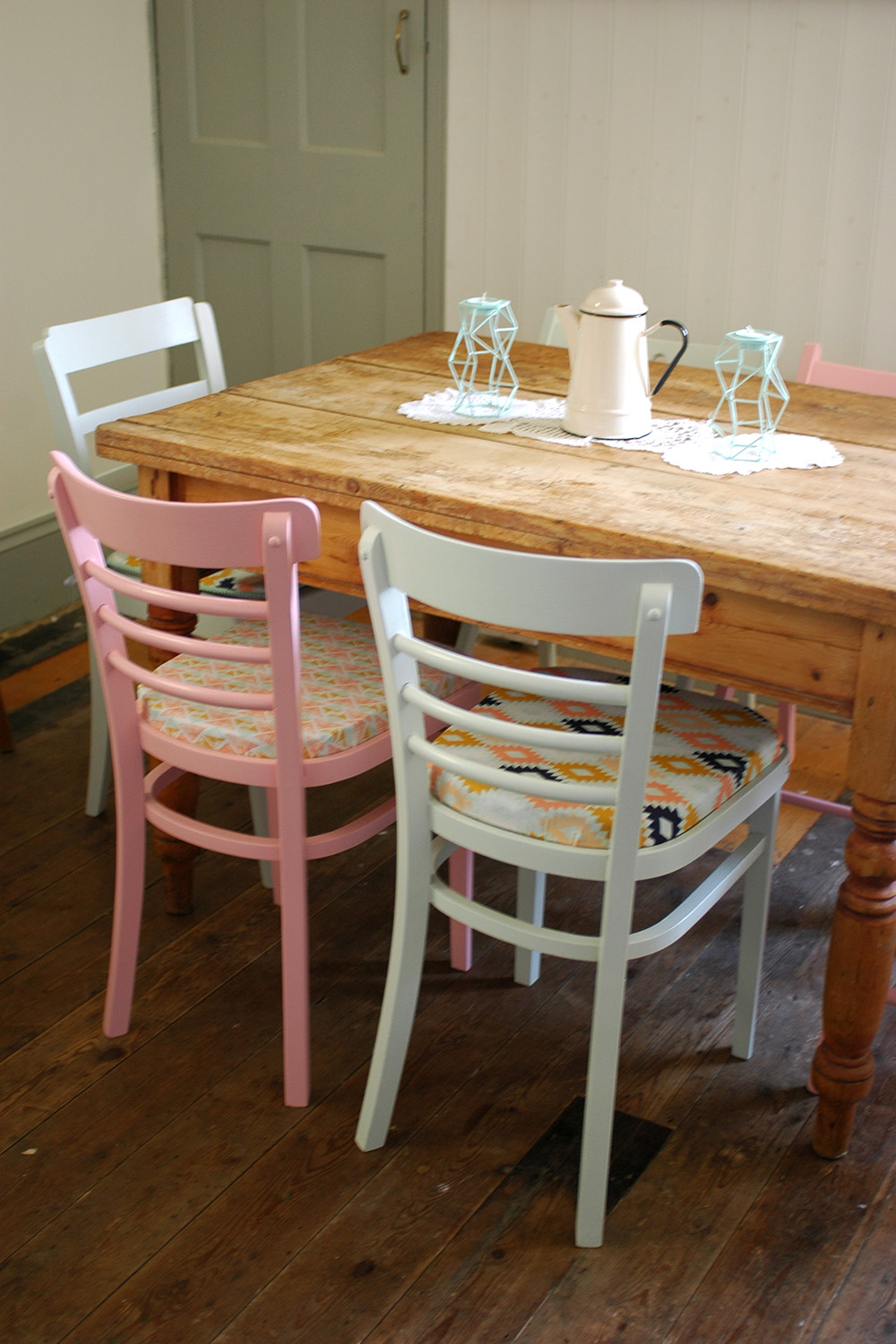
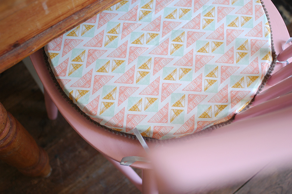
The shots above show off our lovely made.com dining table which I am still really pleased with and I think looks great with my vintage painted chairs. I definitely think I'll be looking to made.com more when we move house. I was super impressed with their delivery service too - the guys were really careful and even built the table for me - massive bonus in my eyes! :) 

If you're a made.com fan you can add your own snaps of your purchases onto their unboxed website and have a nosy at what other customers have uploaded. I really like how they've used a map to show where the homes are located in the country so I can have a nosy at homes in my area! haha! There are some really lovely interiors on there so do have a look! 

A circus themed birthday party

If you follow me on Instagram, you may have already seen quite a few posts about Ruby's first birthday. It's been so lovely celebrating this special time, and while she won't remember it, and doesn't really know what's going on, I still wanted to throw a lovely party for her with our family and friends. She will be able to look back on the photos one day, and see the efforts me and her dad put in! haha! 

Her dad took care of the food side while I of course got stuck into the decorating part of the day. I decided to have a bit of a circus theme, but in a subtle way if that makes sense! I love the 'Toot Sweet' range by Meri Meri, so I ordered a few bits and bobs from there, and then scoured the interweb for other things to add. I purchased some paper plates, straws and bunting from Berylune

The little cardboard circus came from Tiger and was a last minute purchase which I think just completed the table, and for just £3! The long candle was also from Tiger. 

I bought the gold '1' balloon from the party shop, Partica, in Kingston and my mum and I made a LOT of paper chains!

As for little Ruby herself, I wanted to her to have a special birthday outfit but without making her look like a clown - literally! :) So this is how she looked on the day... a classy circus baby!

I got the skirt in Mothercare - it is from the Baby K range by Myleene Klass. I had to order the black vest on Amazon - it is surprisingly hard to find a black baby vest! The hairband was from H&M Kids, and my mum and I made the bow tie! I got the fabric from M is for Make, and we put a little wadding inside to give it some structure. We covered some elastic in the pink fabric to go round her neck. It was fastened with velcro, so unsurprisingly she pulled it off half way through the party! 

We had such a lovely day, although I think Ruby found it a tad overwhelming! Bless her! Today is her actual birthday, but we will have a quieter day with her grandparents. Happy birthday my precious little gemstone xxx


Displaying wedding photos

Today is our second wedding anniversary, hurray! Happy Anniversary hubby! A lot has happened in the last two years, namely one little girl named Ruby, so the time has really flown by since we had our big day in France. I did manage to make a photo album not too long after the wedding, but I was unsure how to display some of our images at home. I didn't want anything too naff, and I wanted to capture a feeling of the whole day rather than just one or two images of us. 

So it's taken me this long to finally decide to create a photo grid which shows us at different moments in the day and also captures the style of the wedding, which was of course very important to me! haha! ;) 

I printed the images via Huggleup who are a London based start-up business, who have a website and iPhone app for printing your images. They very kindly printed this set free of charge for me, but it is only £12.50 for the set of 20, which is a total bargain, especially when it comes to wedding photos. They also do stickers, magnets and posters, which are great gifts but also very useful if you are a business owner. I'd love to get some 91 Magazine magnets made! :) 

I like that this idea for displaying our wedding images isn't permanent. If we want, we can add to it, change some of the images, or display them in a completely different way. I can also change the styling too at any point. At the moment, I have added the tiny vintage tin which we had our wedding rings in on the day displayed below. (the tin says 'Keep this for my sake' on the lid - i love it so much) 

What do you think folks? How have you displayed your wedding photos? Would you consider something like this? 

NOTE: Our wedding photographer was the fabulous Jemma Watts of Pearl Pictures, just in case you are currently looking for a lovely and talented photographer for your big day! 

My home on Apartment Therapy!

Ever since we moved into our home nearly 6 years ago, I'd always dreamed of having it featured in a magazine or on an interiors blog (other than my own!) and though I was often asked to have it shot, I always declined as I wanted it to be 'finished'. Well, of course, your home is never completely finished, there is always something else to do, but as close to finished as it can be at any one time. The main thing was to renovate the kitchen, which we saved for since we bought the place, and finally got round to doing last year. 

So whenever I got an email from Cathy Pyle, a photographer, asking me if she could shoot my home for Apartment Therapy, I was thrilled and excited that I could finally say yes! Apartment Therapy was probably one of the first interiors blogs I'd come across when I first got into blogging.

Cathy visited one Saturday in May, and we had a lovely day chatting and shooting, she even managed to get some half decent shots of me! So now I'm super excited to share the link to the post on Apartment Therapy and below is a little sneak peek. You will also find a source list for where I got lots of our furniture, accessories, art work etc. 

I hope you enjoy having a nosy, and thanks to Cathy for the lovely photos and Apartment Therapy for the feature! 

View the full set of images on Apartment Therapy

kitchen renovation tour

Following on from my last post about our DIY kitchen worktop, I thought I'd share some more images of the kitchen renovation we've done over the last year. I'm so happy with the space now, so I'm quite sad that we are going to have to sell later this year. :( 

Annoyingly I can't find any decent shots of what we had before, but basically it was a small kitchen and a separate dining room which we never really used that often, apart from sometimes in the summer as it opens into the garden. So the main thing we did was knock through the wall between the two rooms. We had to get steel beams installed, and that was probably the most costly bit. We had a back door in the kitchen (where the pink and black print is now) so this was blocked up and then we had a raised floor created for the kitchen area. As I mentioned in the worktop post, I designed the kitchen island myself and a carpenter built it for us. Strangly while they were trying to source some reclaimed wood, it was discovered that we actually had two layers of floorboards in the dining room! So they ended up using the top layer to construct the island, saving us quite a bit of cash! We then white washed all of the wood for a bit of a rustic feel.

It was my dream to have a Smeg fridge ever since we bought this house, so I was super happy the day it arrived! We also had a Smeg hob and built in oven installed, as well as a Smeg dishwasher and washing machine which are tucked in the other side of the island, opposite the fridge. I wanted the lighting to be really simple in the kitchen so we just hung three bare bulbs from fabric covered cable above the island. The freestanding vintage larder I bought from lovely Paul and Sarah of Goose Home and Garden - it is so perfect for all our store cupboard foods, and the lower part has all my china, cake stands and things like tea towels and baking items. 

The tiles in the kitchen are were sourced from Armatile. I really loved the idea of encaustic tiles, but original ones were expensive and hard to look after, so these were a perfect alternative, and I love the patchwork look. The Belfast sink I bought online from TapsUK and I sourced the gold taps from a small bathroom supplies company called Colton bathroom supplies.

I found the vintage school science lab stools on eBay. They were a real bargain, at £25 each! I love how they have got graffiti scratched into the wood! 

In the dining area there were no big structural changes, but we added some tongue and groove cladding to the wall and adding some shelving to help solve storage problems, and then painted the floor in Farrow and Ball Wimborne White floor paint. We actually have a new dining table since I took these photos which you can see here on Instagram which came from made.com. The pendant lights are from John Lewis.

We put in new radiators as the original one was on the wall which was removed. They came from Period House Store. I just ordered the ones that came with primer on, and then I spray painted them in Plastikote Metallic Copper. The sideboard was another eBay find.

I had to have some handmade details in there too, so the dining chair seat covers were made by me, and I also customised the Ikea net curtain, by adding a little bit of Liberty fabric and some pom pom trim to the bottom edge.

And that is pretty much it! Apart from the main building work we really did try to do this on a tight budget, mainly through doing a lot of things ourselves, like decorating, making the worktop, painting radiators etc. I did use some of my industry contacts to get some discounts for things, but I was also super savvy when it came to sourcing fixtures and fittings. All it takes is a little bit of time researching online to find the best deal. 

Anyway, I'd love to hear what you think, and if you have any questions just let me know! ;) 

xxx

DIY: Kitchen island worktop

If you are regular reader or follow me on Instagram, you will more than likely know about our kitchen renovation that we've been doing over the last year. (yeah, it's really taken that long to finish!) This was my original moodboard post. It is finally finished now, and one of the major challenges we faced was the kitchen island worktop. The initial plan was to have it clad in copper - this wasn't a cheap option but something that I was really keen on. This all fell through when the company went awol, then our builders offered to do it, but then they went awol too. They left us with a plywood worktop which, while I actually quite like plywood at the minute, it just looked really rough and unfinished. They also left us with temporary taps as they hadn't yet fitted our new ones and I hated them! The cheapest of the cheap taps that kept twisting round when you turned them! 

We decided we needed to find an alternative to a copper worktop as really it was just a bit expensive. For a while we toyed with the idea of concrete, which I blogged about here. We thought about doing it ourselves, but then concluded that it was just a little too daunting and we might make a real mess of it! So we got a quote from a company to do it, but this was just as expensive as the copper. So we were back at square one. In the end, we decided to go for a simple DIY idea, that would finish off the worktop but not cost a fortune. 

We bought some wooden planks, and simply screwed these on top of the plywood. Thankfully this meant that the hob was now flush to the worktop. (The builders has left it slightly raised up above the plywood for some reason)

This was then all sanded down, and the screw holes and any gaps were filled with wood filler. We then stained and varnished the wood. The final issue was how to cover the edge of the plywood. We went back to the original idea of copper, and bought copper strips and copper nails online and used these around the edge.  

Ta da! This is the finished result! Oh and we fitted the taps ourselves! I think it turned out really well and was a much cheaper alternative. The great thing about copper is that it ages well, so even around the sink where it gets wet, the oxidation and patina just adds to what i hope is a kind of modern rustic look.

It cost us approx. £400 for the materials - the wooden planks, stain, varnish, copper strips and nails. And nothing else but a bit of our time and hard graft. Compared to the quotes of between £1000-£2000 for the copper or concrete worktops, it has certainly proved a more affordable option. It might not be quite as impressive as either of those, but hey, when you're on a tight budget, you often have to compromise. I'd love to hear what you think! x

Garden refresh & DIY plant holder

The bank holiday weekend is a perfect time to give the garden a quick tidy up and refresh. The weather was a bit hit and miss this weekend, but I managed to get enough dry hours to get a few things done. 

Our shed was in need of a lick of paint and the area next to the back door was looking very sad indeed....

I'd found this metal grid in our shed ages ago, and thought I'd find some use for it at some point, so it has just been lying around. Then inspiration struck when I saw what Emily of Makelight had done in her studio. (see her little plant display here)

I gave the grid a coat of white spray paint, and then potted up a some little violas. Then I used copper wire to loop around the pots. I then fixed the grid to the wall using a few raw plugs and screws. Finally I used S hooks to hang the pots up on the copper wire. If you fancy making something similar and don't have a random metal grid languishing in your shed like me, then check out shop-fitting websites like this one for a similar thing. 

I then simply rearranged the furniture a little, moving the bench under the grid and adding a few colourful pots of flowers on the decking. Please ignore the decking by the way! This is a job for next weekend - cleaning and re-staining! :) 

I also managed to give the shed a couple of coats of paint to freshen it up and added a few pots here too. It's now much more appealing to go and sit out in our garden than before! What do you think?!

Have you had a chance to give your garden a little spruce up yet? Why not give my little plant display DIY a go! ;) 

NOTE: This post is my entry to the Garden SOS Campaign by www.mkmbs.co.uk. The challenge was to makeover a small area of your garden for under £50. I used lots of things I already had, and spent my budget on materials (spray paint, wire, s hooks, paint) as well as some new plants and a watering can! Fingers crossed I win the £500 garden makeover! ;) 

5 tips for a mini bedroom update

Our bedroom has been feeling a little unloved of late. We don't spend that much time in there really, apart from sleeping, and it's easy to just dump things in there or let things pile up. So at the weekend I thought it was time for a little tidy and a bit of refresh. 

I didn't do much,, but it has really made a difference! Maybe I'll even go and spend some time reading my book in there this evening.... So here are my 5 tips for a quick and easy bedroom update!

1. Buy some new bed linen

This has made the main difference in the room. We've had plain white sheets on our bed forever, and while I do like white they seem to go grey and dull so quickly, and I'm always having to replace them. So this time I opted for a patterned set which fits in really well with the other nature related elements in the room. This duvet and pillowcase set is from BHS, and a snip at £35 for the king size version. 

2. Make some new cushion covers

I really needed to refresh the cushions that I had on the bed, so I decided to whip up a few new covers with a bit of Liberty fabric. One of my favourite patterns is pepper, so I choose two colours in this design and used some ribbon to trim the opening. They are just super simple envelope covers, but I'm really pleased with them. 

3. Add some flowers 

For me, displaying fresh flowers in any room makes such a difference. It may seem like a bit of an expense, but all you need is a stem or two in a bottle or vase, so rather than buying a big bunch just pop in your local florists and choose a few individual stems. Also look out in the reduced section at the supermarket, sometimes you can find a great bargain on flowers that only have one sorry looking bloom. 

4. Restyle the bedside tables

This is the area where things can sometimes accumulate: books, handcreams, coffee cups, phone chargers etc. But as this is potentially the first area you see in the morning, and the last one at night, it should be a joy to look at! Give it a little tidy up, add a scented candle or two, those beautiful flowers and maybe tape a cute postcard or favourite photograph to the wall and voila! - a simple pleasure to enjoy every day! 

5. Tidy and clear clutter

As any interiors book or magazine will tell you, the bedroom should be a tranquil, uncluttered space, so if like me, it has started to build up, just take an hour to tidy things away, and discard or put in storage anything that you don't really need or that isn't pretty. It'll make your bedroom a much nicer place to wake up in each day! 

I'm certainly feeling much happier when I go in the bedroom now! If you'd like some more inspiration for your own bedroom, check out my Bedroom Style Pinterest board too! 

Thank you to BHS for sponsoring this post, and for supplying the beautiful bed linen.

xxx

Our bathroom makeover

As I mentioned in my recent 10 ideas for styling a small bathroom post, we have been redecorating our own bathroom, and now that it's all finished I thought I'd share a few snaps of it. It's really tricky getting decent photos in such a small room so this is the best I could do, but hopefully it gives a bit of an idea. 

Of course I forgot to take any decent 'before' shots and only remembered after we'd started preparing the room for painting, but these images show the beige-brown wall colour and white woodwork which has been there since we moved in over five years ago. (excuse the filler!) 

It wasn't actually that bad before, although it was definitely in need of a refresh, it was still liveable. But it was the installation of a new boiler that spurred us on, as we had the new cupboard in the corner built to house it, so this needed painting anyway. 

We decided to brighten the walls in plain white and used Dulux Timeless (it looks quite beige on the website, but actually comes up quite white), which is actually the colour we've used in many of the other rooms in the house. But to add a little bit of interest we painted the woodwork in a lovely shade of grey. This is Dulux Modest Grey in matt finish. I hate gloss paint which I know a lot of people use on woodwork, but I'm really pleased with the finish the matt paint has given - it seems much more modern to me. 

As I said in my bathroom inspiration post, I wanted to add a few simple details in the room to lift it. As it's such a small room, it only needed a select few nice items such as a delicious Anthropologie candle, and a lovely bottle of handwash which I found in TK Maxx. I've went for dried stems of eucalyptus and billy buttons in vintage bottles, and a flowering house plant for a little bit of greenery. (here's hoping I can keep this one alive!) The little bar of soap on the windowsill is from The Future Kept

On the walls, I've hung some of my vintage plates that used to be in the hallway, a new mirror I bought from Rockett St George and in the reflection of the mirror you can see a framed print which was given to us by a friend. 

And that was basically it! A lick of paint, and a few decorative touches and it feels like a totally new room! It might be small, but your bathroom should never be neglected! :) 

A special thank you to Dulux for supplying the paint for this makeover. 

xxx

DIY: pom pom trim seat pads

You might remember a little while ago I shared my dining chairs makeover? After painting the chairs in two Farrow and Ball colours, I decided to make seat pads to tie the look together. I chose two fabrics from M is for Make, and was able to alter the shape and size of the seat pads to match the individual chairs. My tutorial for making these is up on the AO Life blog, so if you fancy a go, pop over there for the full instructions

Dining chairs makeover - before and after

Regular readers will know that this year we had our kitchen renovated. During the building and decorating work, some things somehow managed to get ruined, even if they were packed away, and my mismatched dining chairs all ended up looking grubby, paint splattered and generally a bit tatty. 

I'd been meaning to repaint them anyway for ages, so when Farrow and Ball offered me some of their paints for a makeover project, it was just what I needed to get on with it. I ordered two colours - Nancy's Blushes and Pale Powder. I decided that while my chairs are different styles (I have two pairs and two random ones), I wanted to bring some uniformity to them and thought these two colours would look great together. 

They all needed a good sanding, and I must admit I had a little help from my dad when it came to this project, sanding, priming and painting 6 chairs is not something you have a lot of time for when you have a small baby!! The chairs were primed using Farrow and Ball's Interior wood primer in white and light tones, followed by two coats of the colour.  

And here they are! I'm really pleased with the colours and the finish on the chairs, it's really brought them back to life! You must ignore the state of our floor - that is another thing on the to do list, to paint at some point!

As you'll notice I also make some new cushion pads for the chairs. This gorgeous fabric is from M is for MakeI'll be sharing the tutorial for making the cushion pads over on AO at Home in the new year so look out for that.

I'm so pleased with how the chairs now look. Thank you Farrow and Ball for the gorgeous paint, and giving me that little push I needed to get this job done! 

Check out all of the gorgeous Farrow and Ball  paint colours.

Art in the kitchen

The walls in our new kitchen have been pretty bare for the last few months while I decide what and where to hang things. But when I saw this print by Yourtype in the Southwood Stores online shop, I swiftly sent the link to the hubby as an idea for my birthday. I thought he'd decided against it, but then a few days after my birthday, to my joy, it arrived! 

It's a large print in need of a large frame, and I was very lucky to have collaborated with eFrame - an online framing service - who provided this lovely white wood frame. I mentioned how I used them for the artwork for Ruby's room also as you can create bespoke frames to your own size specifications. 

Funnily enough I don't actually drink coffee, but at the moment I feel like the word coffee here should be replaced with baby! That is pretty much my routine at the minute!! 

thanks to the hubby for the print and to eFrame for providing the frame. 

New lighting in my home

The clocks turned back last weekend, so it is darker earlier these days. So when Homebase recently offered for me to choose some new lighting to help illuminate my home during the winter months, i jumped at the chance. Good lighting, whether it's candles or electric, really does create atmosphere and cosiness and I'm really pleased with the two choices I made from their Habitat range

Firstly, for our bedroom I chose this bright orange lamp. I am really loving orange at the minute, especially this bright, eye popping shade. As our bedroom is mainly pale, subtle colours I love how this lamp has now added a splash of colour, which brightens up quite a dark corner even during the day. 

The colour of the lamp reminded me of the berries on a Solanum plant (also known as Christmas Cherry - perfect for this time of year) so I picked up one of these while in Homebase also, and I think they look lovely together. 

Here it is switched on - the perfect little bedside reading light! 

My other choice was the Helena flower lamp. This light has been around for about 10 years, designed by Helena Christensen for Habitat, and it's one I've always admired, and I thought it would work really well as a feature in our new kitchen/dining area.

I love how you can bend the 'stem' of the flower around into a shape you like, and how it looks like it is 'growing' out from behind the sideboard! It almost echos the shapes of the real flowers at the other end of the sideboard, and the copper flower adds a flash of metallic colour.

DSC_7977LO.jpg

With a lovely orange-y glow it creates a lovely atmosphere in this corner of the room in the evening... it's definitely a piece I can see me owning for years and years to come and moving it around as our home (or future homes!) evolve.

Thanks so much to Homebase for these lovely items! 

xxx

Finally finished - my patchwork quilt

Back in June 2013 I started making a patchwork quilt. I'm generally quite impatient, so a project like this was going to test me a little, but I actually really enjoyed having something I could pick up now and again and work on in front of the TV. Saying that, it's not a regular occurrence when I don't have something else more important to work on or do, so it has taken me over a year to finish the quilt! 

It was sewn by hand using the paper piecing technique and I used bits of fabric I found cheaply in haberdasheries or in vintage shops. Quite a few of the fabrics were used to make napkins for our wedding last year so I thought it would be nice to include these as they'd remind me of the day. 

I originally started following an online course via The Amazings, but as it took me so long, by the time I was getting to the construction stage The Amazings website had closed! So I had to find another source to learn how to finish it. I used this tutorial as I wanted a shaped edge as opposed to a straight one. I'm not sure whether the wadding i used was too thick or if it's the way I've quilted it, but it is very textured in comparison to the one in the tutorial, but I actually quite like it. My edging isn't perfect either, but hey, for a first go I'm pretty happy with the overall result. 

For the backing I bought some Liberty fabric from eBay...

It isn't full double bed size - mainly because my impatience kicked in and I just wanted to finish it! I've got it on our bed at the moment, but one day I will probably give it to Ruby for her bed. That's if it hasn't fallen apart by then! ;) 

I'm pleased I stuck it out and finished it though, it's been really rewarding. What I found is that a long term craft project creates memories as you make it. I loved picking out the fabrics for it,  it reminds me of certain day trips when I bought some of the scraps. I also spent quite a lot of time trying to get it finished while I was pregnant so it will also remind me of that really special time in my life, and then finally finishing it off during the last few weeks with Ruby sleeping at my side. It will be lovely to tell her that when she is older. 

Are you a fan of the long term craft project? Or do you prefer to start and finish something quickly and move on to something new? 

Win a Rewined Candle

October is here, and while September was a great month weather wise, it is set to change this weekend and everyone is now thinking of autumn and getting cosy! I do feel a little like summer has passed me by this year with the arrival of Ruby.  We spent one of the hottest weeks of the year cooped up in a hospital room and were desperately wishing for cooler weather, and since being home, while it's been nice going for walks with the pram, I've generally been too worried about Ruby getting the sun on her or her getting too hot! We are spending quite a lot of time at home with her, so I am actually fine with the idea of autumn arriving and just curling up with my little family in front of a good film.

And of course for that cosy atmosphere, candles are a must, so it was lovely to receive this gorgeous one from Rewined Candles recently. 

The South Carolina based company make the candles from recycled wine & champagne bottles. The soy candles scent mimics the tasting notes of wine - yum! The one I received was Champagne scent and smells delish. I'm really loving the design on the candles too, what do you think? 

If you like the look of this, then listen up! Rewined Candles are giving one Patchwork Harmony reader the chance to win a candle, and you can even choose the scent you would like! 

To enter just visit their online shop and then leave a comment on this post saying which scent takes your fancy. You can get an extra entry by tweeting: "I've entered to win a @rewinedcandles candle via @patchworkhrmy www.patchworkharmony.co.uk/blog/2014/9/2/win-a-rewind-candle "

TERMS: 

Closing Date is 10th October 2014. 

Open to UK and international entrants.

Winner will be selected at random and you will be notified by email.

Make sure you leave a contact email address so you can be contacted if you win. 


Concrete kitchen worktops

So when we were having our kitchen renovation done earlier this year the plan was to install a copper worktop on the kitchen island. Sadly, our first experience of builders / contractors hasn't been a great one. We were let down by the company who were supposed to do the worktop (they just stopped replying to my emails) and then our builders said they would do the worktop as well as the rest of the building work left us high and dry before completing the job.  (Monumental Construction, we are not impressed!)

I've since learned that this is commonplace for builders to abandon smaller jobs near the end to move on to bigger, better paid jobs, which I think is shocking. We were left to finish off plastering, exterior brick work and other jobs ourselves, and of course have been left without a proper worktop. For the last few months we've been living with a plywood worktop which is not waterproof, and while lots of people say they quite like it, it's not the look I was hoping for! This is how the island currently looks...

After considering trying to do the copper worktop ourselves we've came to the conclusion that is just going to be too expensive, and as we also need a new boiler this year, we started looking for alternatives. I still want something a bit different, so we are now looking into concrete. We are wondering if it's possible to do this ourselves following this tutorial on A Beautiful Mess. Has anyone ever tried this or know if it would work on the plywood? 

via A Beautiful Mess

via A Beautiful Mess

I also came across the kitchen below and really like the idea of adding in some lovely tiles or other detail within the concrete... I'm not sure where or what yet, but these Moroccan tiles do look lovely... (Image source: Expressen.se)

What do you think? Does anyone have any experience of concrete worktops? I'm so sick of the kitchen not being finished now, I just want this project done! :) 

xxx

Bare plaster walls

When we were renovating our new open plan kitchen/dining area, we ended up with a few areas of bare plaster where lining paper had got pulled off by the builders which stayed like that for a while as we worked our way round the room decorating it. Weirdly both hubby and I commented on the fact we kinda liked it, although at the same time knowing that it didn't really suit the house and the fact it was only the lower part of the wall did look a little odd. When I posted a pic of it on Instagram saying that we were about to panel over it, I was surprised at the number of comments saying to keep it as it was! Perhaps it looked better on a small phone screen on Instagram, below is the pic...

While this rough, pared back look is nothing new - I remember posted about the Rough Luxe trend back in 2012 - I think that maybe it's becoming a bit more commonplace. Chances are that you'd get some comedic house guests enquiring as to whether you are in the middle of decorating, but in general as long as it's done well I think more and more people can see the beauty in this natural look...
 

photo by Freya Dowson

photo by Freya Dowson

The shot above was from a recent shoot for 91 Magazine. The stylist Catherine Sprunt has bare plaster walls in her bedroom which I think looks really great, especially when contrasted with metallic details such as copper.

One of my favourite examples of a bare wall is that of designer Sandra Juto in her Berlin home. It creates such a simple, but textured backdrop for all her pieces of art and other quirky objects.

The bedroom below has went one step further and left some peeling wallpaper on the wall, and I love how they've tied the colours into the luxurious bedspread. I think that's what makes the bare plaster wall work - the contrast it creates against smoother, sleeker or shinier textures.

What do you think? Could you do this look? I was too chicken and we've panelled over ours (I will share some 'after' pics soon) although I think if we had have been brave it would have been more work, as I think it would have looked best to have the entire wall exposed... I'd love to hear what you think!

xxx

DIY: Pom pom magnets

Pom pom making can be seriously addictive, so it's lucky there's so many things you can do with them - decorate gifts with them, make a garland, trim a blanket or cushion with them, even add them to a pair of slippers! This week I decided to give my new fridge a little pom pom love with some cute little magnets...

I think they look really sweet, and give a little bit of tactility to area which is mainly hard edges and surfaces. They are SO simple to make as well, you can follow my tutorial over on the AO at Home blog.

Let me know if you give them a go! ;)

xxx

The nursery makeover

If you follow me on Instagram, you've probably seen a few little sneak peeks into our baby's nursery already, but as it is finally finished and all ready for our new arrival, due in a couple of weeks time (!), I thought I'd share some photos of the whole room.

DSC_7763_580.png

The room had been my office before, stuffed full of craft supplies, books, props, paperwork etc, so I've really had to downsize on that front and in fact the cupboard on the right hand side is actually being used to store a lot of that stuff. The wallpapered wall on the left used to be covered by a bank of ikea shelving that were there when we moved in. Hiding behind the shelves was a botch job of a partition wall, so we had this rebuilt when we had the builders in recently. Apart from that, in terms of decorating, all we've done is paint the walls and ceiling white, wallpapered and repainted the floor.

I'm so pleased with the wallpaper by Ferm Living, which I ordered via This Modern Life. It is perfect for growing with our little one, as it's not babyish, but still a lovely nursery pattern. The cot is from John Lewis, please excuse the plastic covering on the mattress! The baby will sleep in our room for the first few months, so I've left that on there for now!

I bought the 'Whale in Paris' print from one of my fave shops, The Hambledon, on a recent trip to Winchester, and the honeycomb decorations are from Ikea. The fox cushion is by Sweet Reverie available at Society 6, and the little striped cushion was a lovely gift from a new brand based in Barcelona called Mint Banana.

This lovely knitted blanket was handmade by my mum (thanks mum!), and the spotty one came from Gap.

These drawers were a fab eBay find. The little pink turtle was handmade by Ooh La Lapin and the gorgeous moccasins are by Monkey and Mole. The toadstool lamp came from Bimbily - it's the only place I've seen stocking the gold version of this, so I was really pleased to find it.

The curtains are a simple set of grey linen ones from Ikea, but I've customised them with a little bit of pink pom pom trim, which was so simple to do and I think really adds something to the curtains.

I've blogged about the little cupboard before which I bought from the fab Goose Home and Garden. The huge pink honeycomb ball was another Ikea purchase, and the ice cream one is from The Hambledon. The 'My Daily Melody' print is by Audrey Jeanne, which I bought online from Tea and Kate.

I've had these little shelves for a while, I bought them in a charity shop for £5 and have just repainted them. The 'little girl' postcard and the elephant also came from Tea and Kate - I love how the elephant's pom poms match my curtains! The Polish wooden dolly was picked up at The Vintage and Handmade Fair which i visited a while back. 

blogged about artwork for the nursery a while back so you might recognise some of these prints. The seal is from Isa Form, the elephant on the bike is by Ez Pudewa and the other elephant is bySeventy Tree. I've managed to frame all the artwork relatively cheaply, with a mix of Ikea frames for the standard sized prints and then some custom made frames by eFrame - which is a fab online resource, where you can enter in the exact dimensions of your print, what type of frame you want, whether you need a mount etc, and they are delivered to your door. I'm always really pleased with them and think they are affordable considering they are custom made. 

The very last thing we added to the room was this light from John Lewis. It is made from plaster and punched with lots of tiny holes, so gives off a really soft light which is perfect for the nursery. Again, I like how it's not childish and will last for years to come in the room. 

So there you go! The finished room! I've tried to keep it quite simple as it's a small room, but I'm sure it won't be long before it is filled with lots of baby paraphernalia, so it's nice to have a record of how it looks before the chaos takes hold! ;)

Just one more tiny thing to be added in a few weeks time! I'll be sure to give you an update when our little one makes her appearance!

xxx

My kitchen moodboard

So, finally after years of saving and gradual planning in my head and on Pinterest, our kitchen renovation is happening! Well, it was supposed to start today, but didn't, so fingers crossed the builders will be here bright and early in the morning.

A lot of things won't be decided until the wall is knocked through between our kitchen and dining room, but I have planned a lot already, and have even started ordering the fun stuff, which has got me so excited! :)

So here is a little idea of what I'm aiming for, we shall see if it turns out this way, probably in a couple of months by the time we decorate etc, but I will keep you updated on the progress!

image via sfgirlbybay.com

image via sfgirlbybay.com

One of the main features will be a reclaimed wood kitchen island and I'd been looking out for some suitable stools for a while. I was looking for some that had a bit of an industrial feel to sit nicely against the reclaimed wood, but struggled to find some within budget, or that were the right height or colour. I loved the ones in this shot above, so was chuffed to come across these on eBay the other day which have a similar look, and for a budget-friendly £25 each! So in the shopping cart they went, I can't wait to receive them and see them in the flesh! 

The island itself is based on this kitchen which I've loved for years. Basically it will be made from reclaimed wood and painted white. But to give it a bit more of a contemporary feel we've went for a copper worktop. I'm really excited about this as I think it'll be a great feature, and the copper ages really nicely and is antibacterial, bonus! It's being made by a local company to us called Tipfords.

image credit: Paul Massey

image credit: Paul Massey

I also have all our appliances on order - which are all Smeg. I'm so happy to finally be getting the fridge I've been wanting for years! And the sleek design of the rest of the appliances should hopefully contrast well with the reclaimed wood too. I'm hoping our oven will be able to fit in a chimney breast that is currently blocked in, it sounds a little weird, but fingers crossed it will work out! We've already had the sink delivered, which is the one above, a belfast sink (something else I've wanted for ages!) but with a little bit of detailing on the front panel. The sink came from TapsUK and those are the taps I have my eye on fromVictorian Plumbing
 

The rest of the kitchen will be free-standing, and I'm still on the look out for pieces that I love. Something like these above would be great - again I love the contrast in the left hand pic between the sleek fridge and the roughed up paintwork on the cabinet...

To add some subtle colour and pattern, I decided to go ahead with the patchwork tiles you may remember me posting about a while ago! These ones are from Armatile, and while I did love the real vintage encaustic tiles, these seemed like a more affordable option, that will be much more durable and easy to maintain.

I hope to build in some open shelving in one corner that would otherwise be dead space, so I hope that will work out ok, and for lighting we are again bringing in that industrial look with some bare bulb pendants something like these...

That's kinda where I'm at at the moment, there will be lots more happening in the rest of the room, but as I say, I think some things will be decided as we go along! I've taken a lot of inspiration from varying places, images I've found and my own ideas, so I just hope it all comes together as one when it's complete!

xxx